Smooth e-commerce at Nosto
Nosto is an AI-powered personalization solution for the world’s top eCommerce retailers. Leveraging innovative and advanced machine learning, Nosto builds an unique understanding of the customer base. This enables incredibly powerful predictive capabilities in real-time, delivering increased customer engagement and increased revenues.
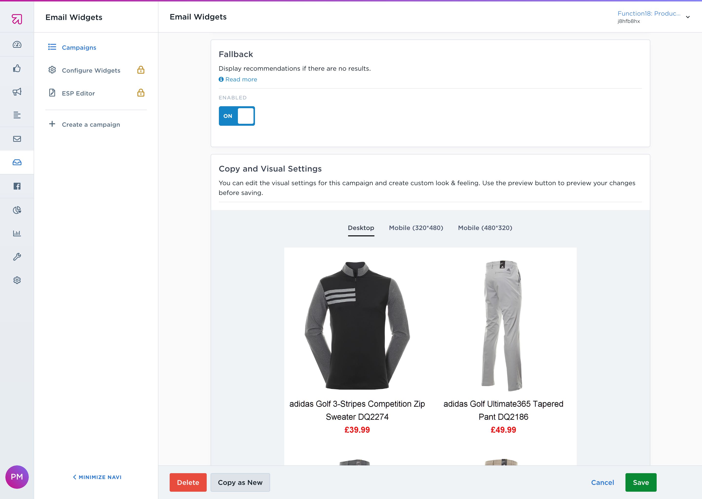
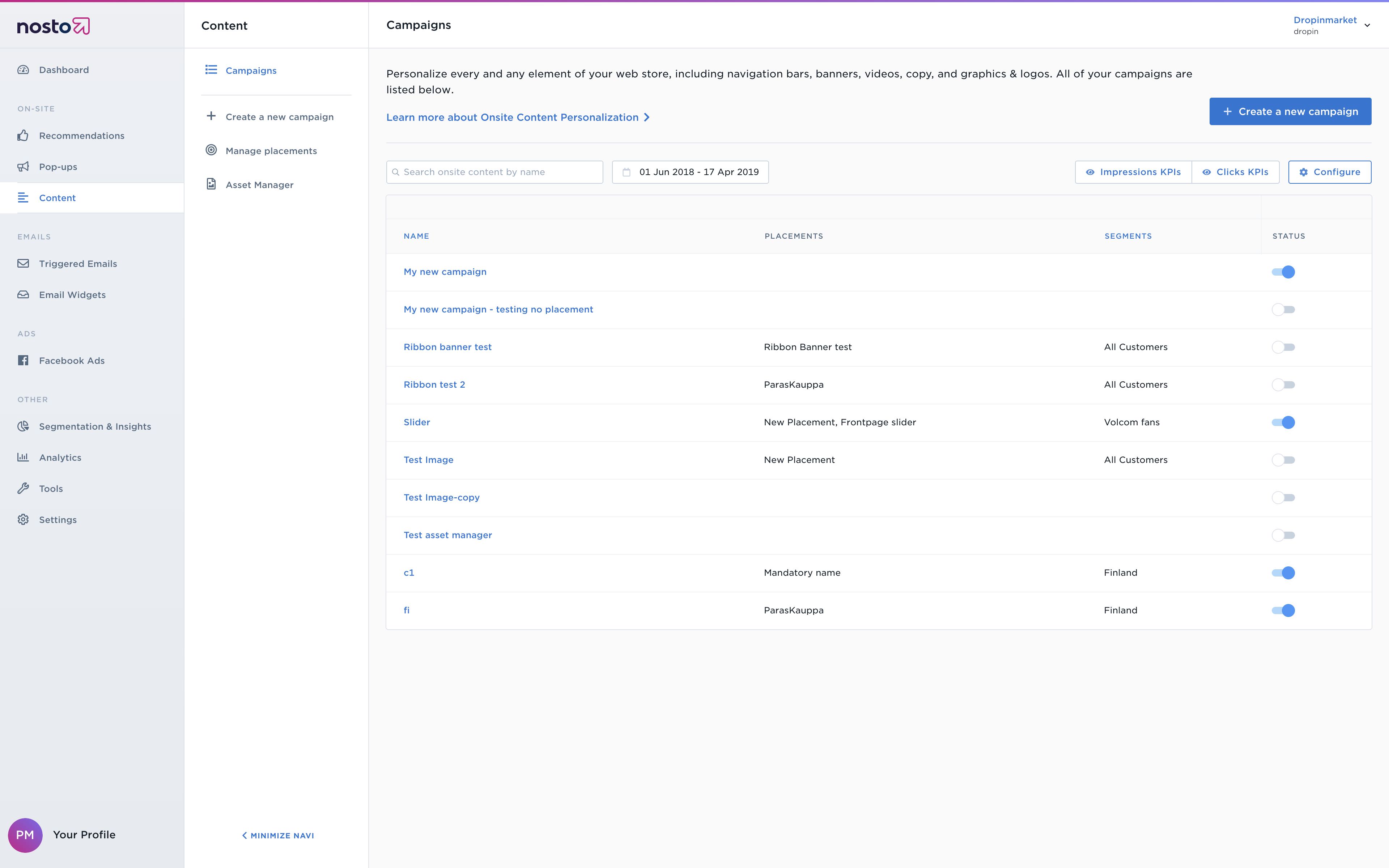
At Nosto, I contributed to cutting-edge products such as segmentation and insights, onsite content personalization, personalized emails and triggered pop-ups for eCommerce. This meant understanding requirements from leading merchants, designing innovative and efficient workflows for them, and continually iterating and improving that through testing and feedback. The finished features would enable merchants to create new personalization campaigns through the Nosto admin UI to deliver personalized user experiences for the end-user and more revenue for the merchant.
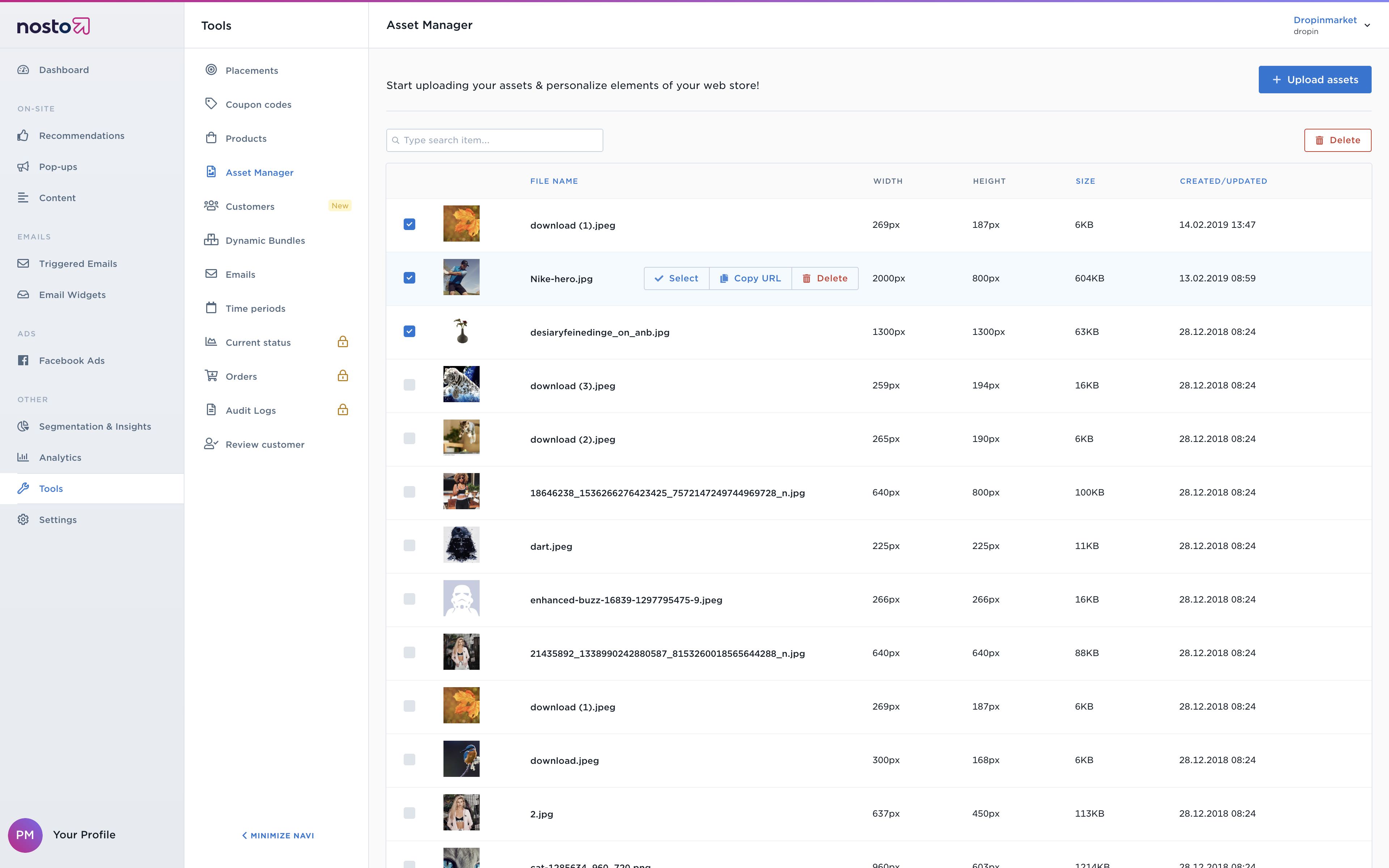
Data-driven design
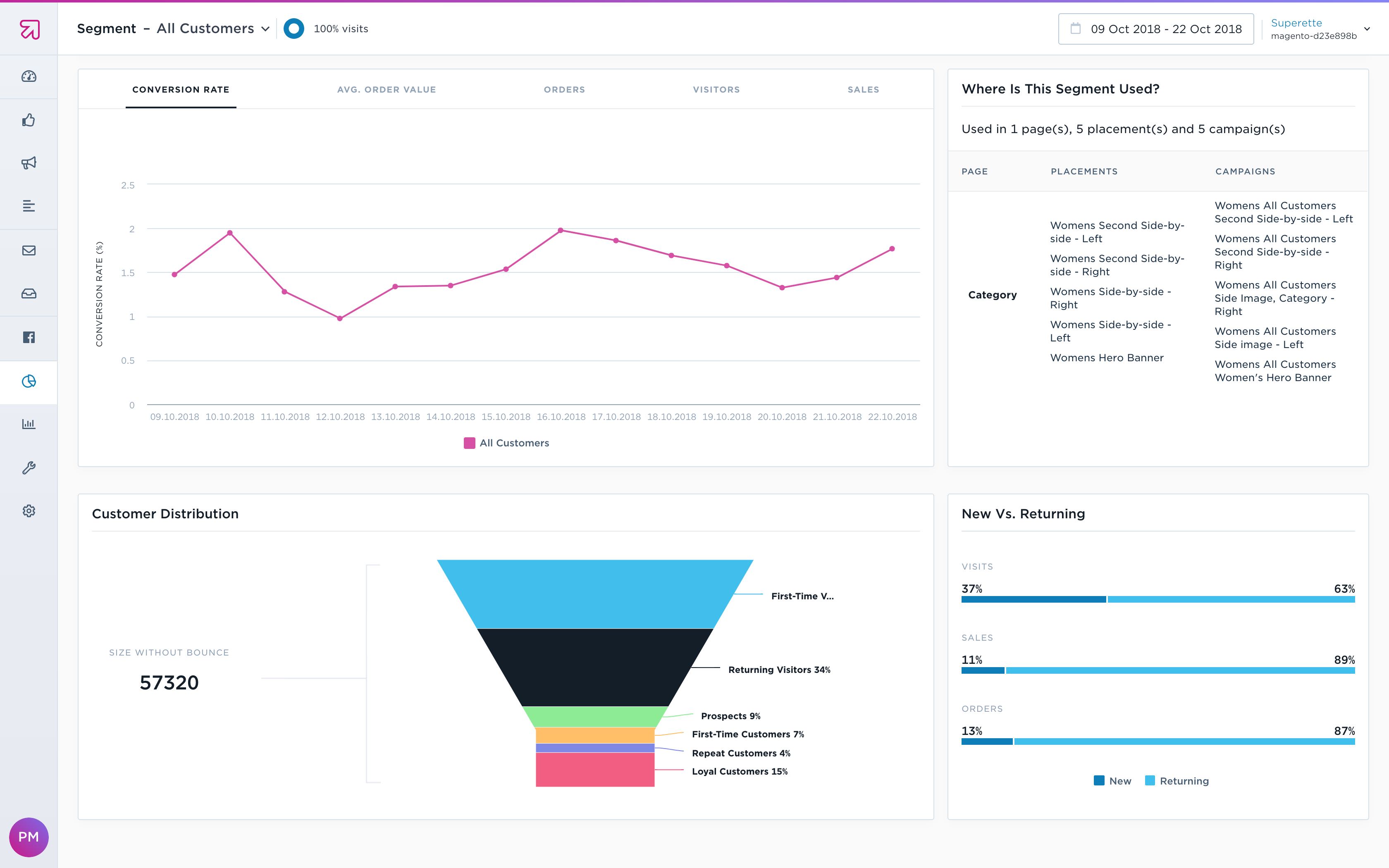
Almost all the interfaces designed at Nosto were driven by data. Nosto laid great stress on measuring and quantifying everything, and no design decision or design change was taken lightly. Views were data-heavy and scalable – Nosto has thousands of customers globally.

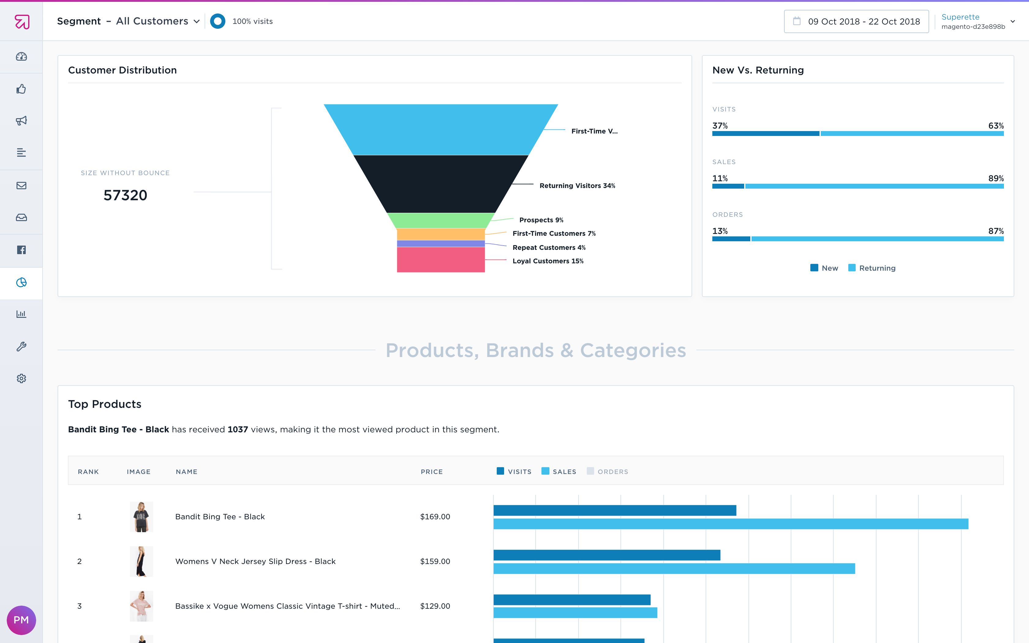
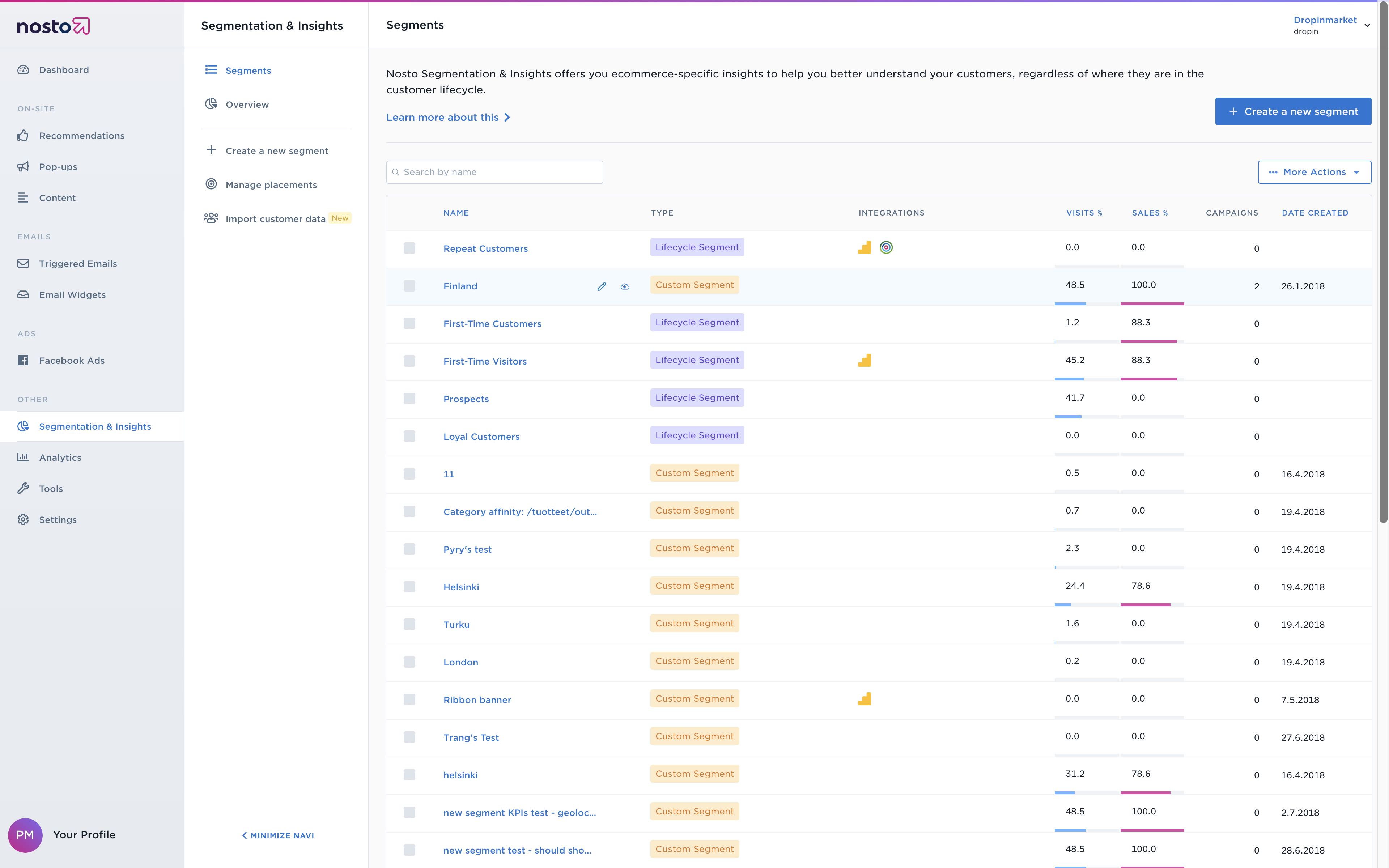
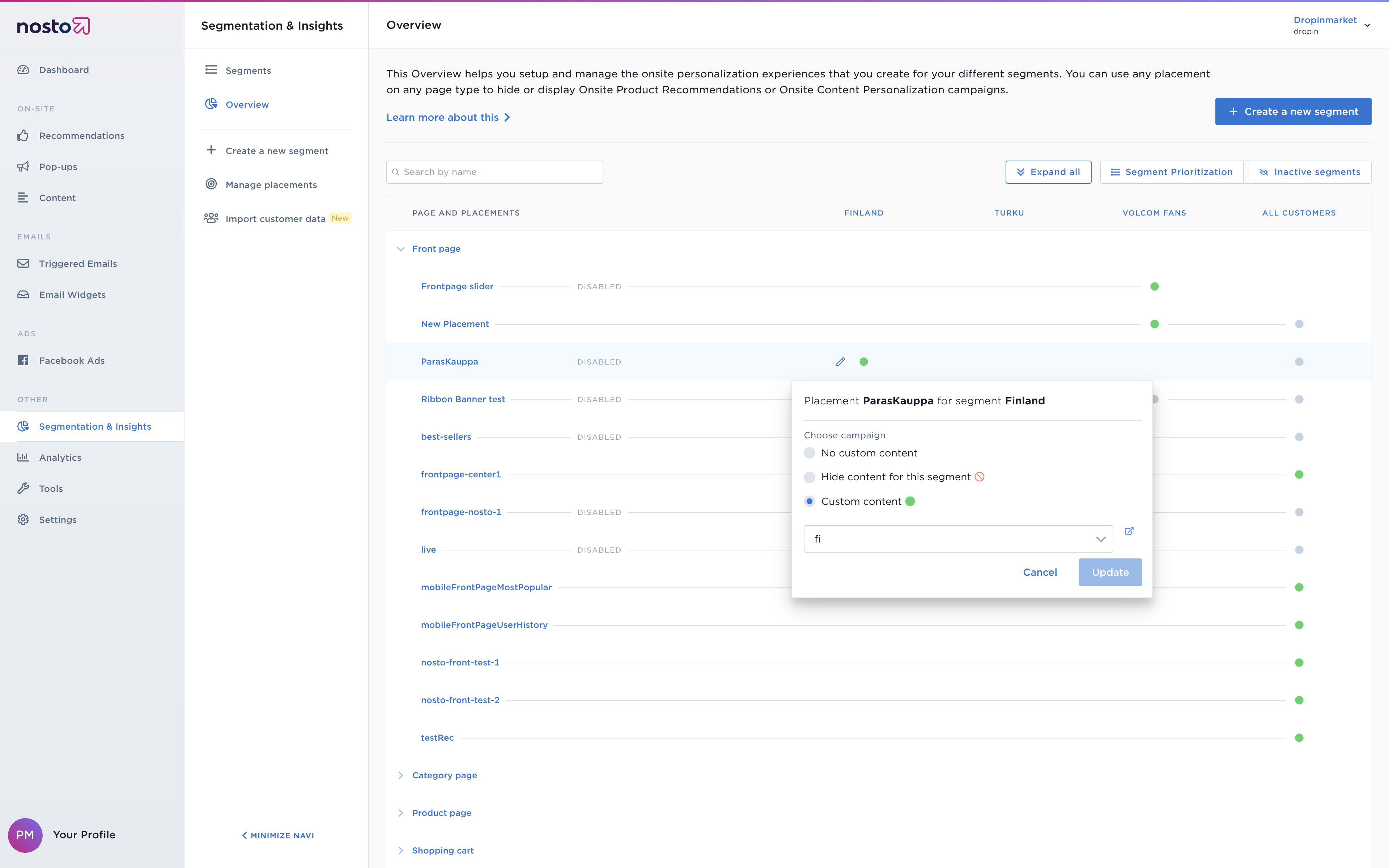
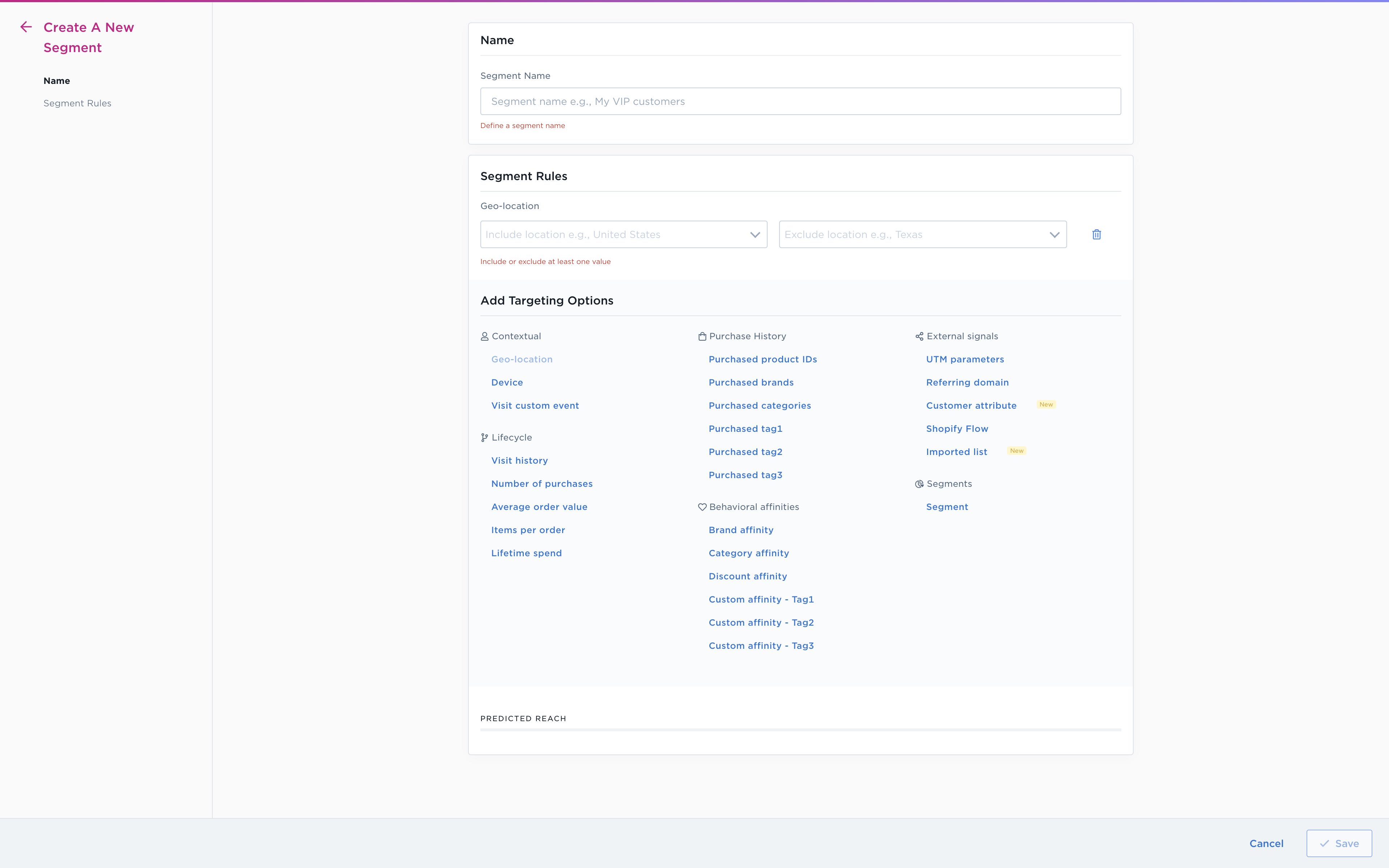
Segments was the most complex, as well as the most iterated section during my time at Nosto. The dashboard, while appearing simple, packed away a lot of details into sub-tabs. Other views combined and utilised with inline-visualisations, iconography, contextual reveals, contextual modals, complex data-tables and wizards.
Keep visualisations simple. Don’t make the user think.
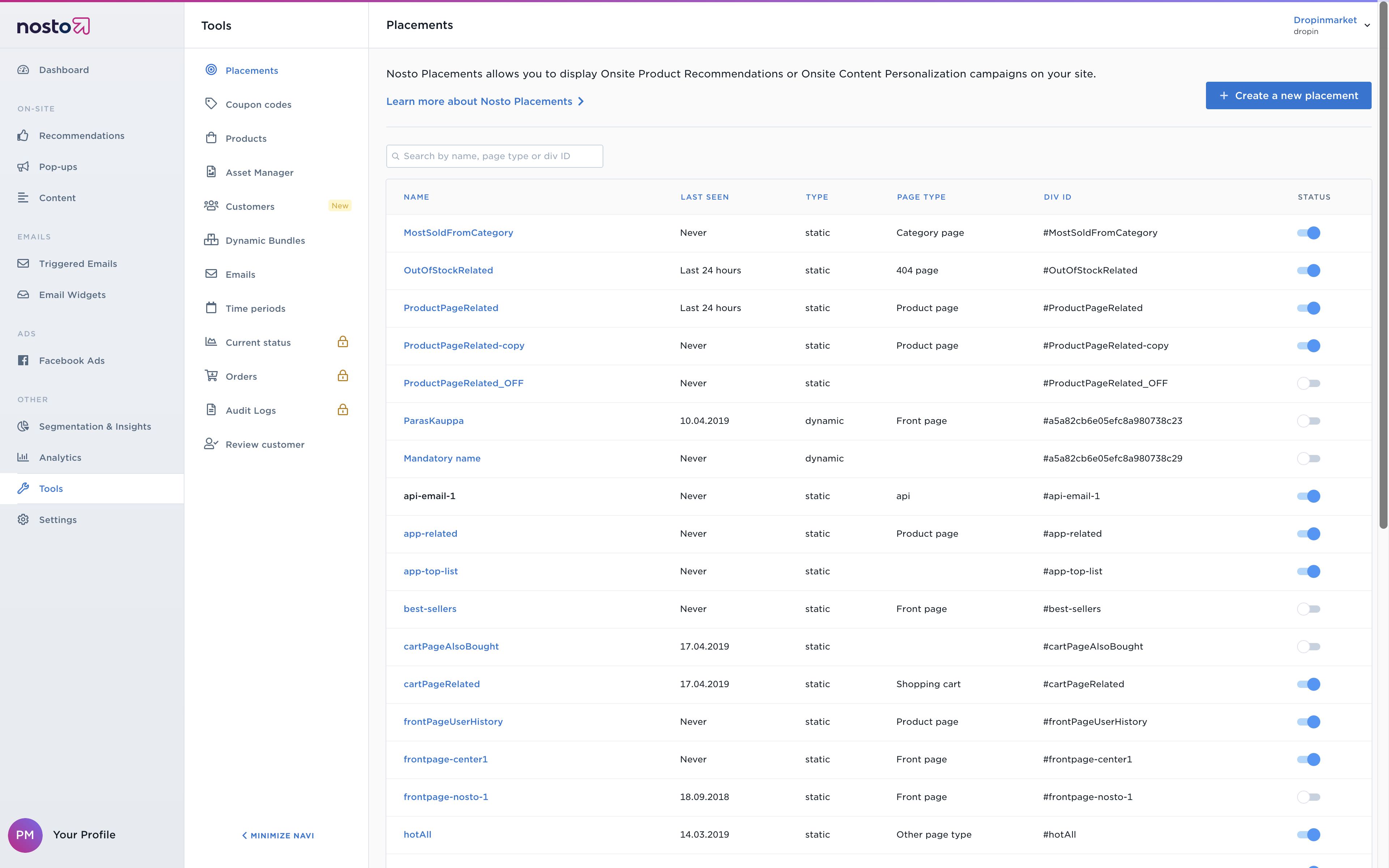
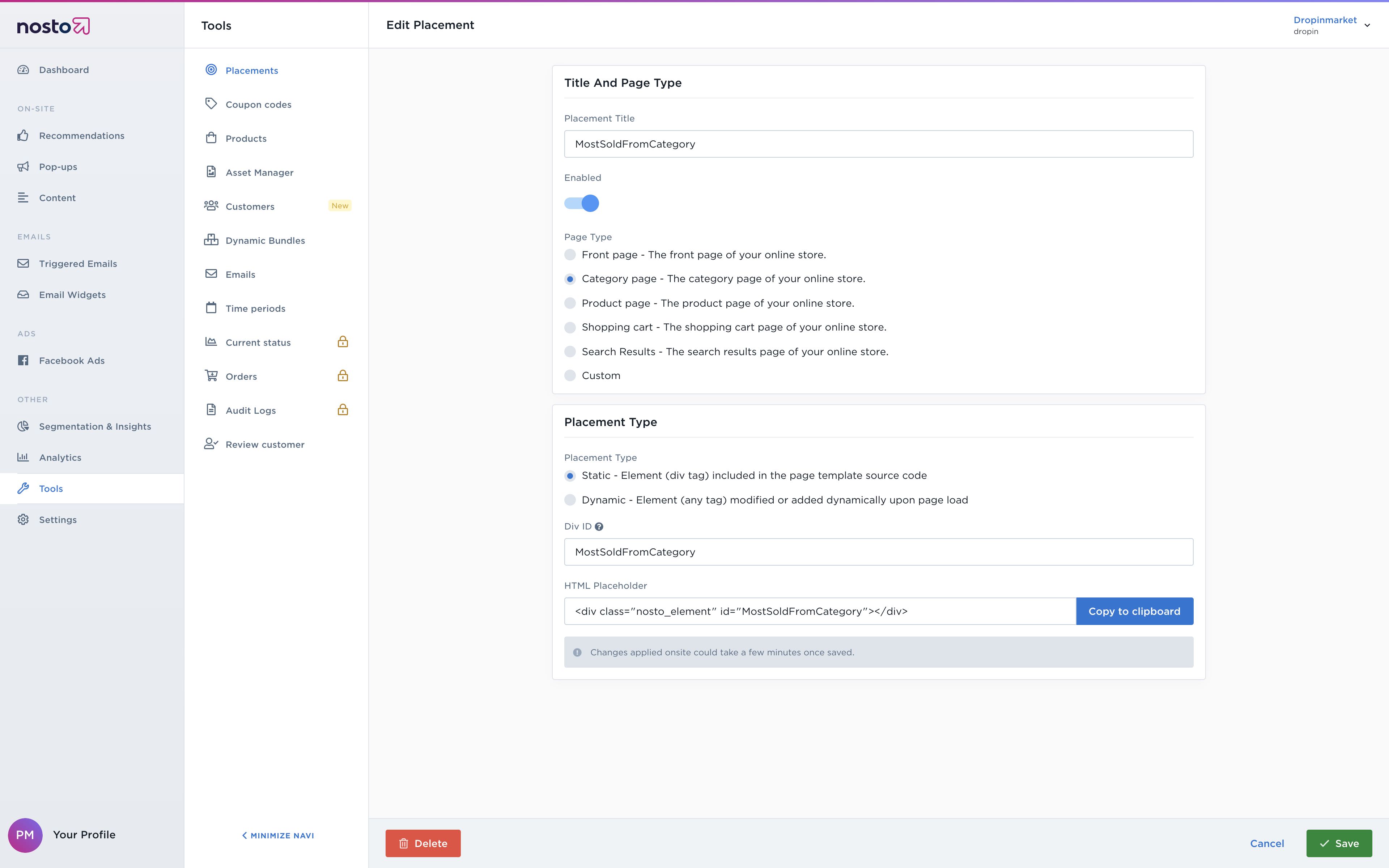
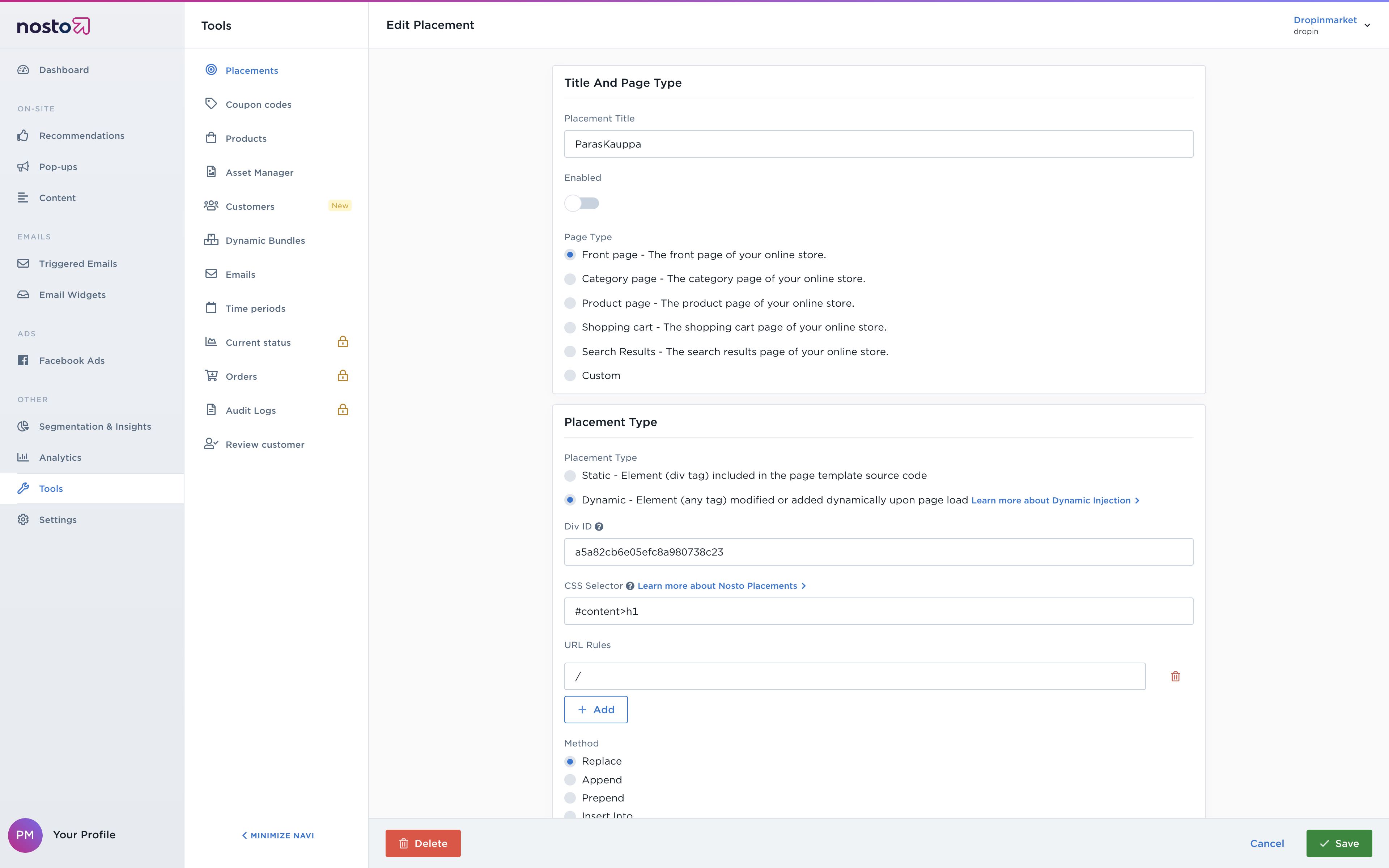
Most settings were configured via multi-step wizards. This was done to keep contextual settings together, and also to break up complex settings into graspable chunks.
UI Redesign
We implemented a full redesign of the Nosto user interface with Nosto Design System. The design system is connected to the production, and significantly streamlined the design process and deploying. The design system is based on VueDS and published as a private NPM package. VueDS uses Theo in the background to synchronise design tokens across JSON & SASS. Following the Atomic design principles, tokens are consumed by elements (the simplest components such as buttons and input fields), elements are consumed by patterns (such as date-pickers and data-tables) and these are then combined into templates (views).
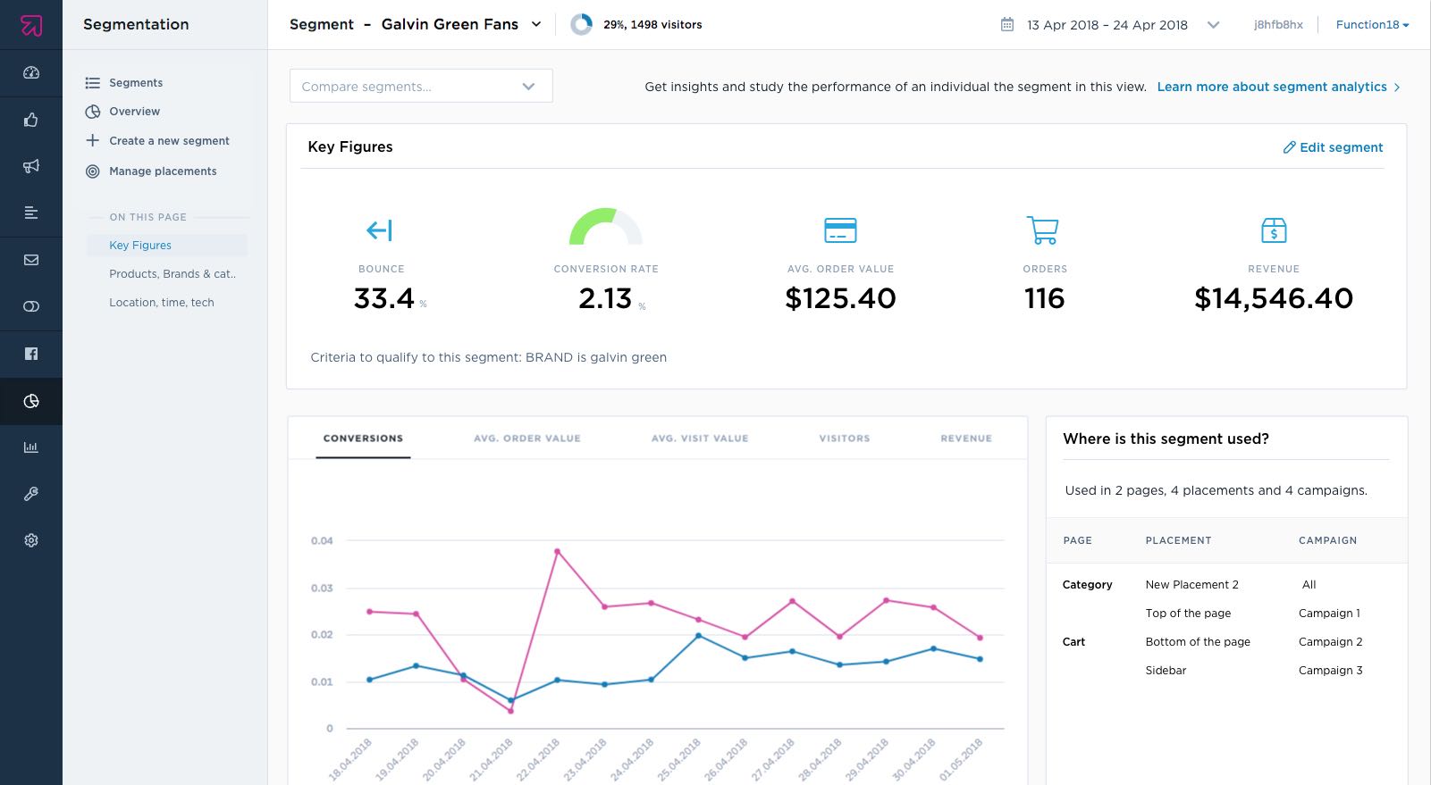

Delivering a consistent user experience and a faster development cycle
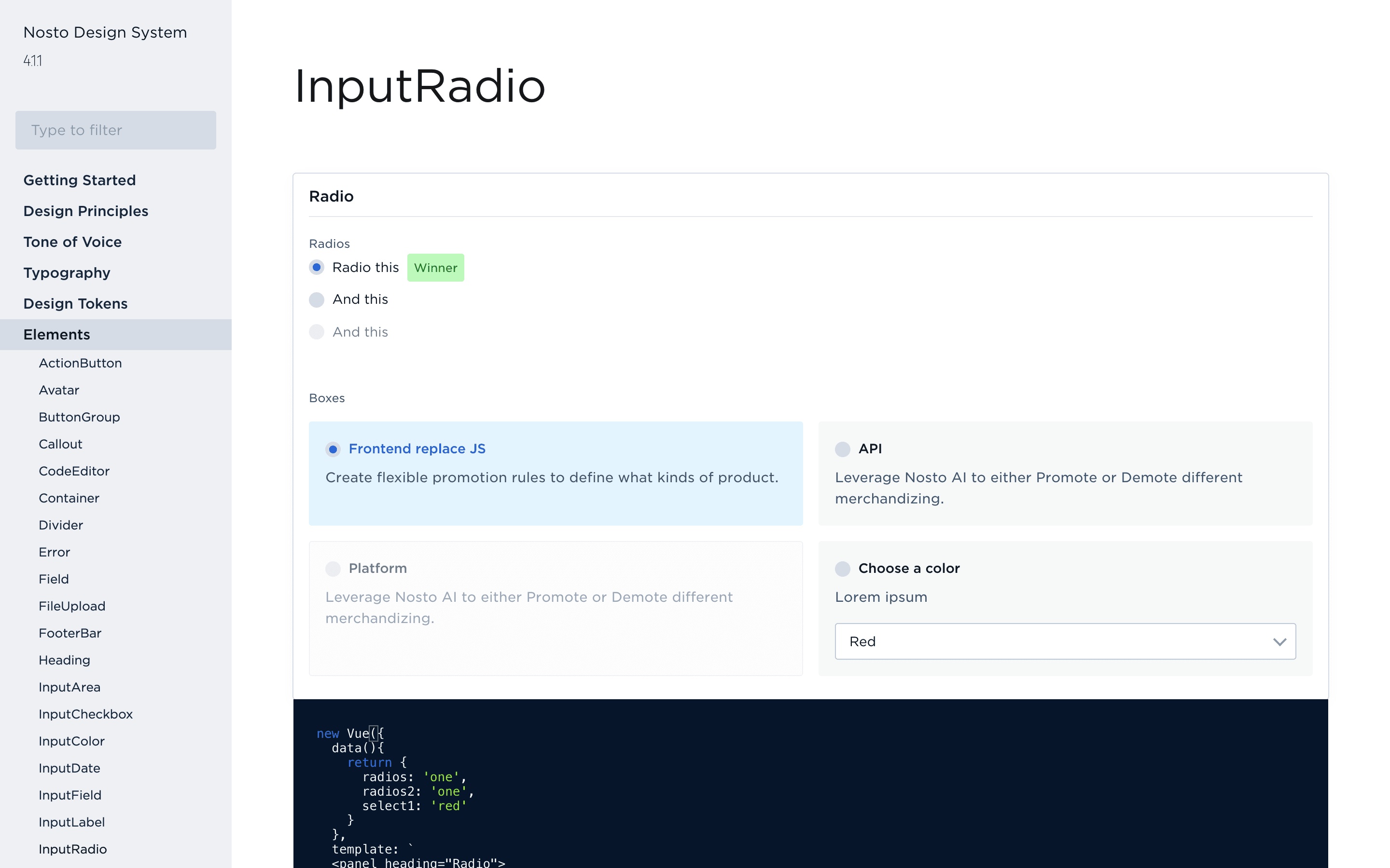
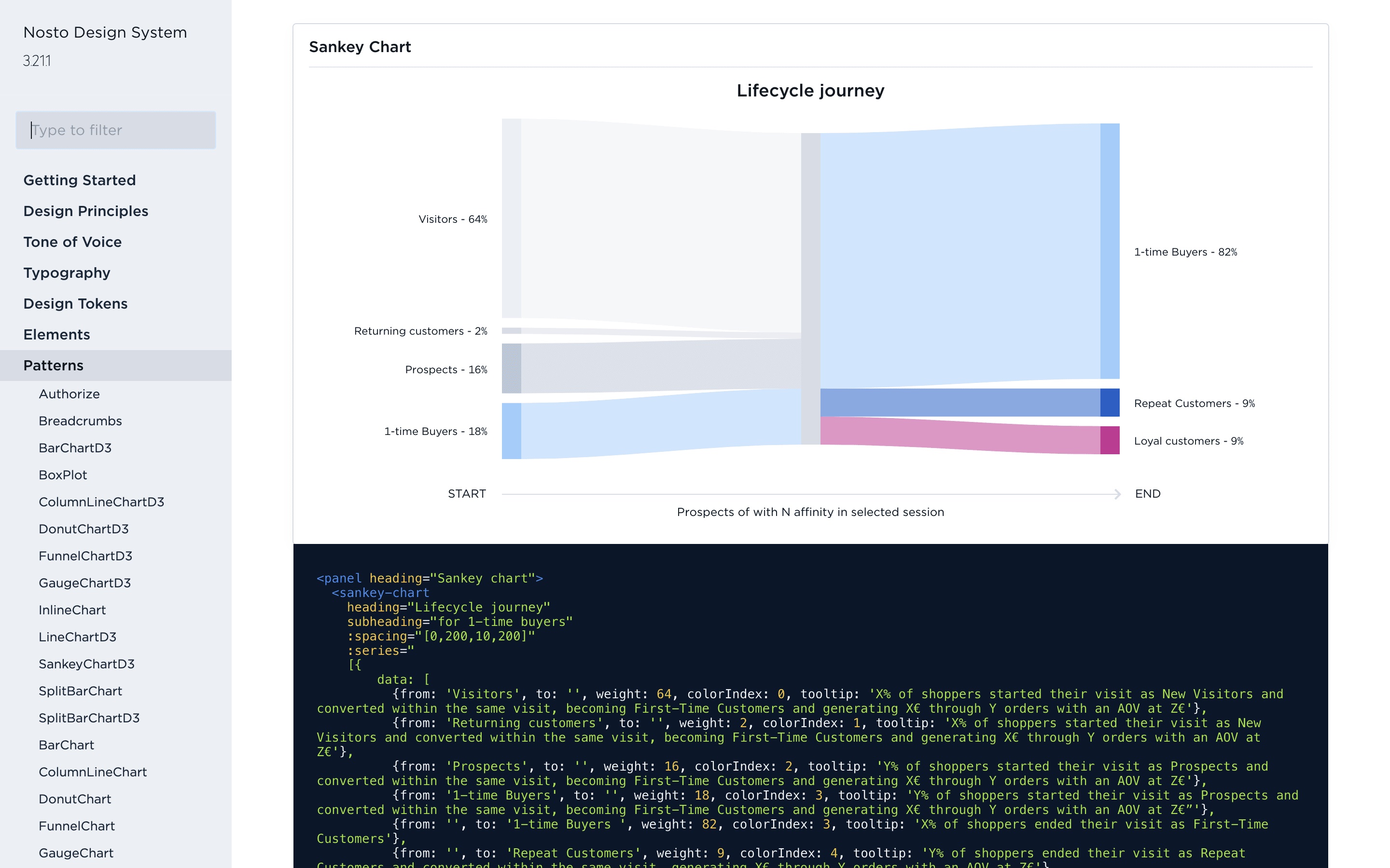
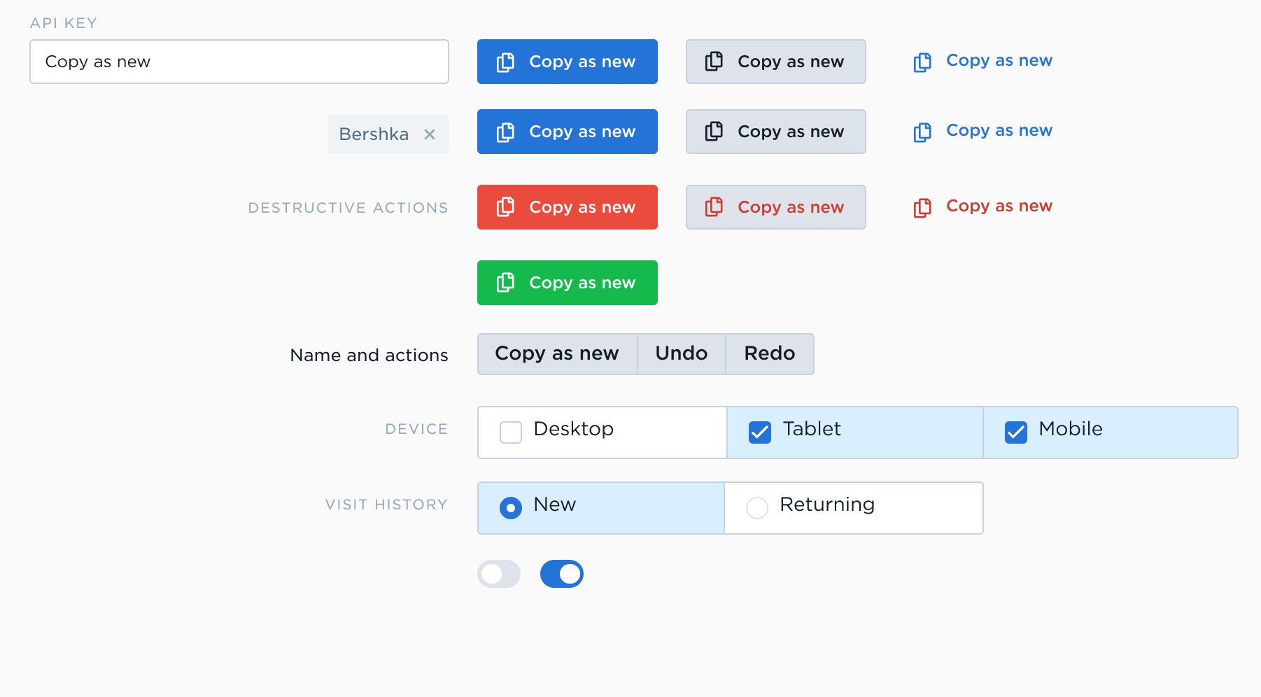
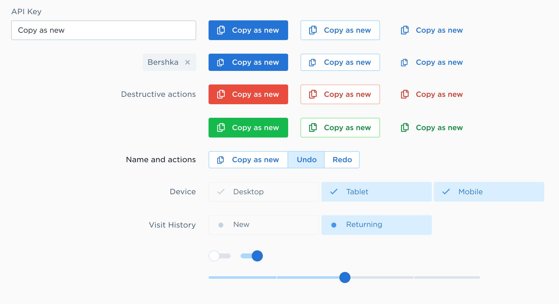
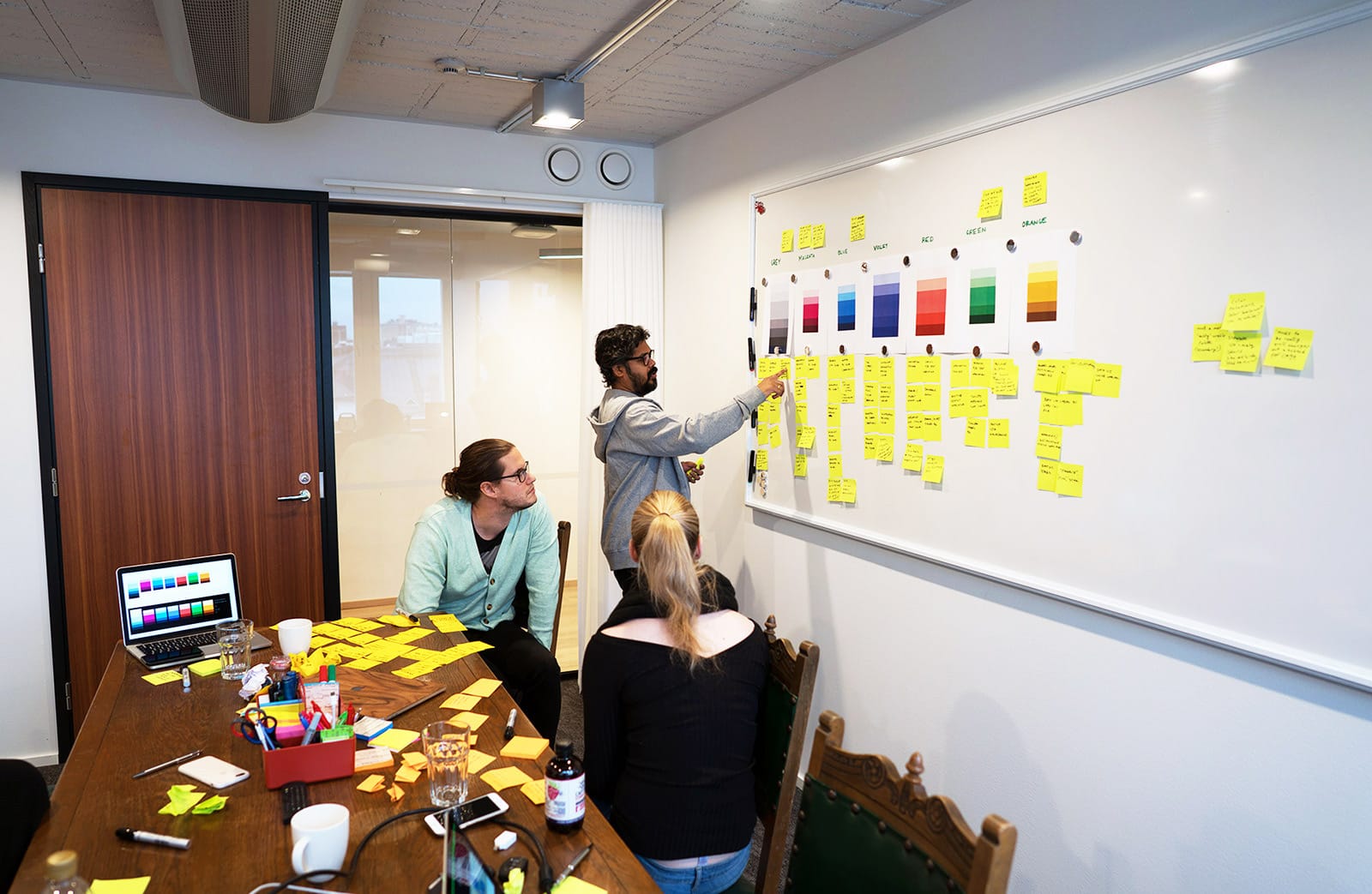
We were taken through workshops, followed by intensive design sprints (by @viljamis) and then periodic check-ins. Over a few months, we defined components, styled and rigged them, deployed and then iterated them. I worked extensively on the baseline grid system that informed the basic sizes of input elements, the color-scheme, and the analytics (charts and inline both).
Spacing and baseline grid are 80% of the crucial early decisions. Color is the remaining 20%.
