Rethinking data-apps at Rain
At RAIN (by Lempea), I am helping the team build the next generation of data-applications that can be configured, deployed and monitored straight from the browser. I am solely responsible for the design of the app, and ensuring quality control of the frontend.
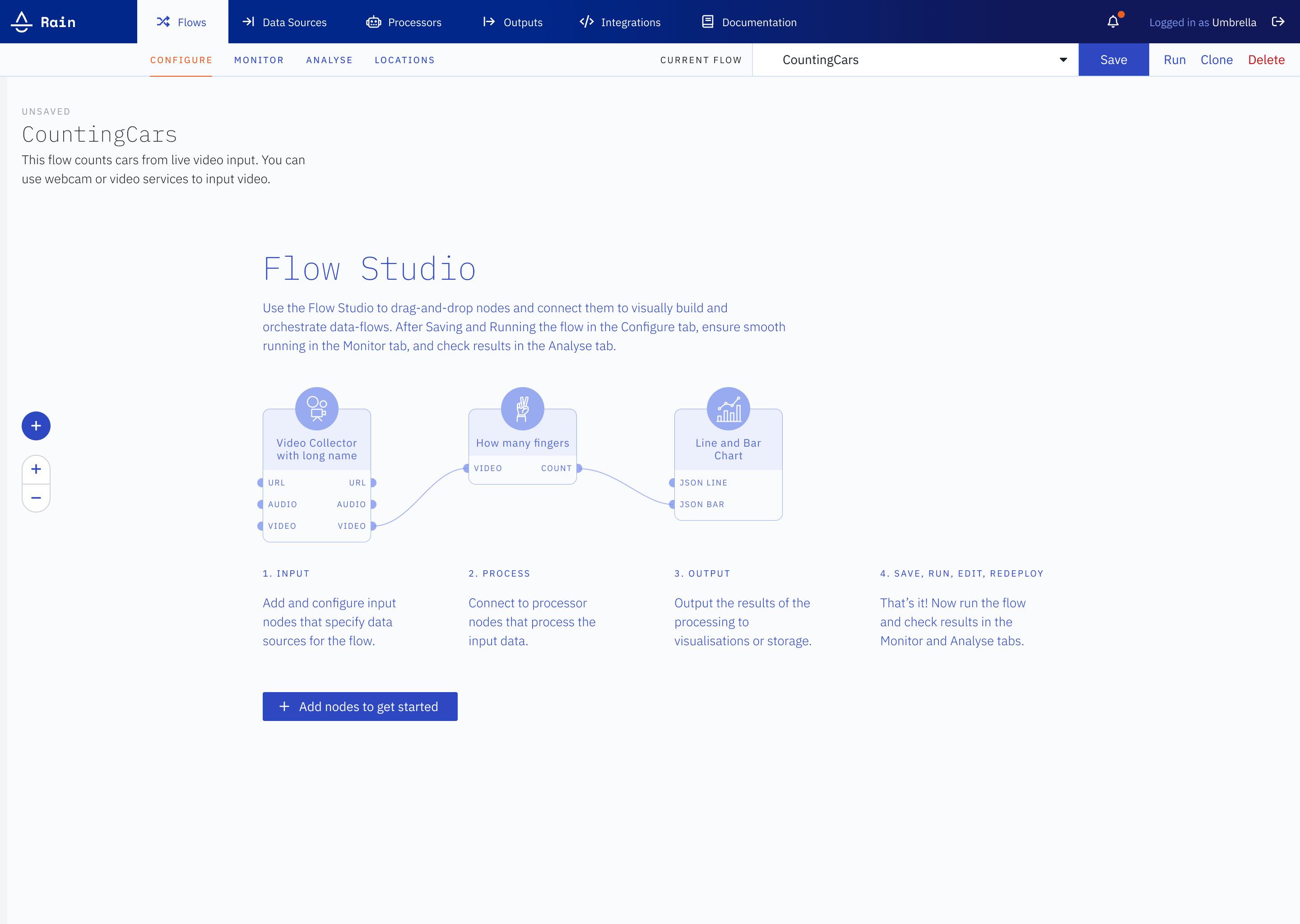
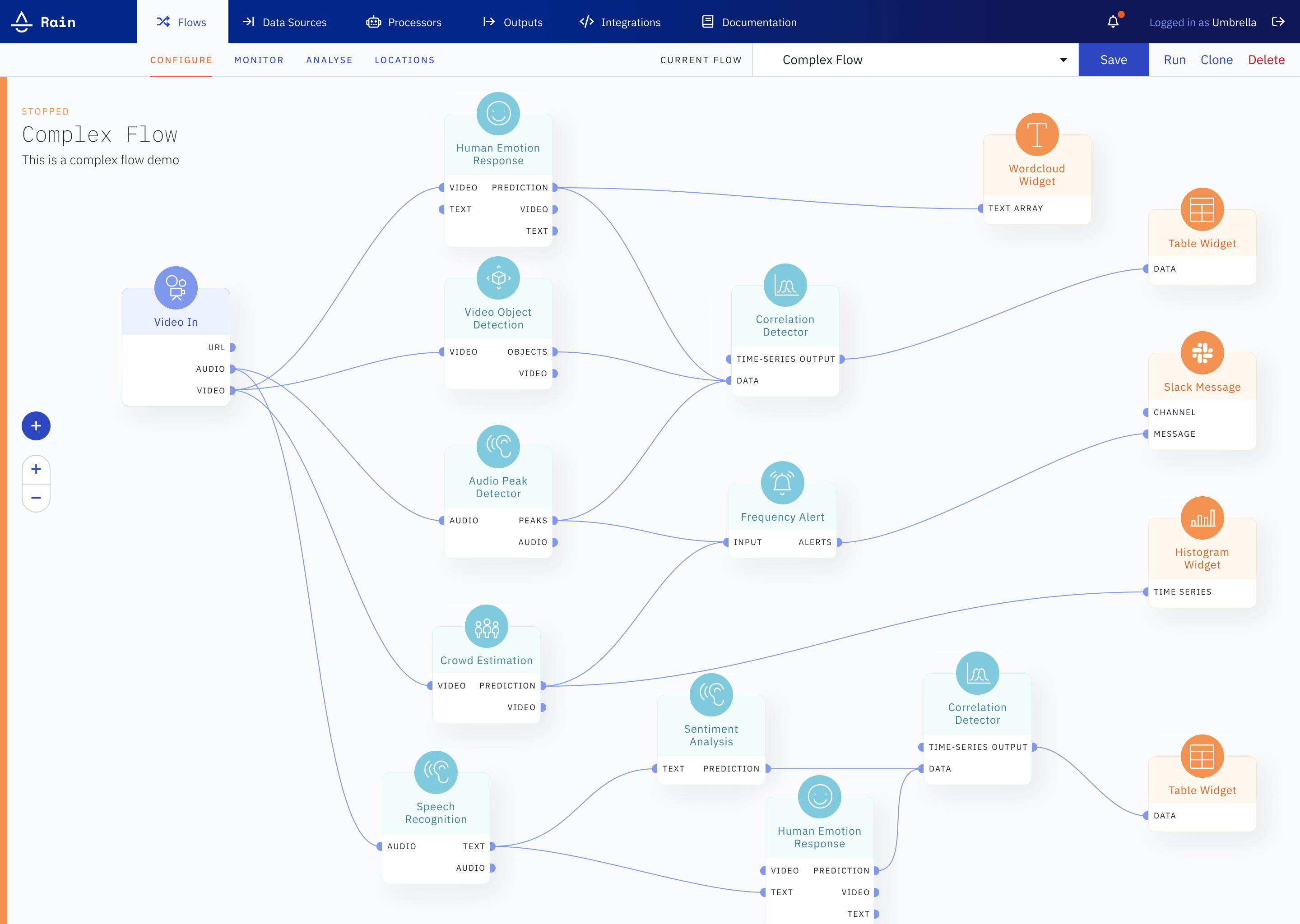
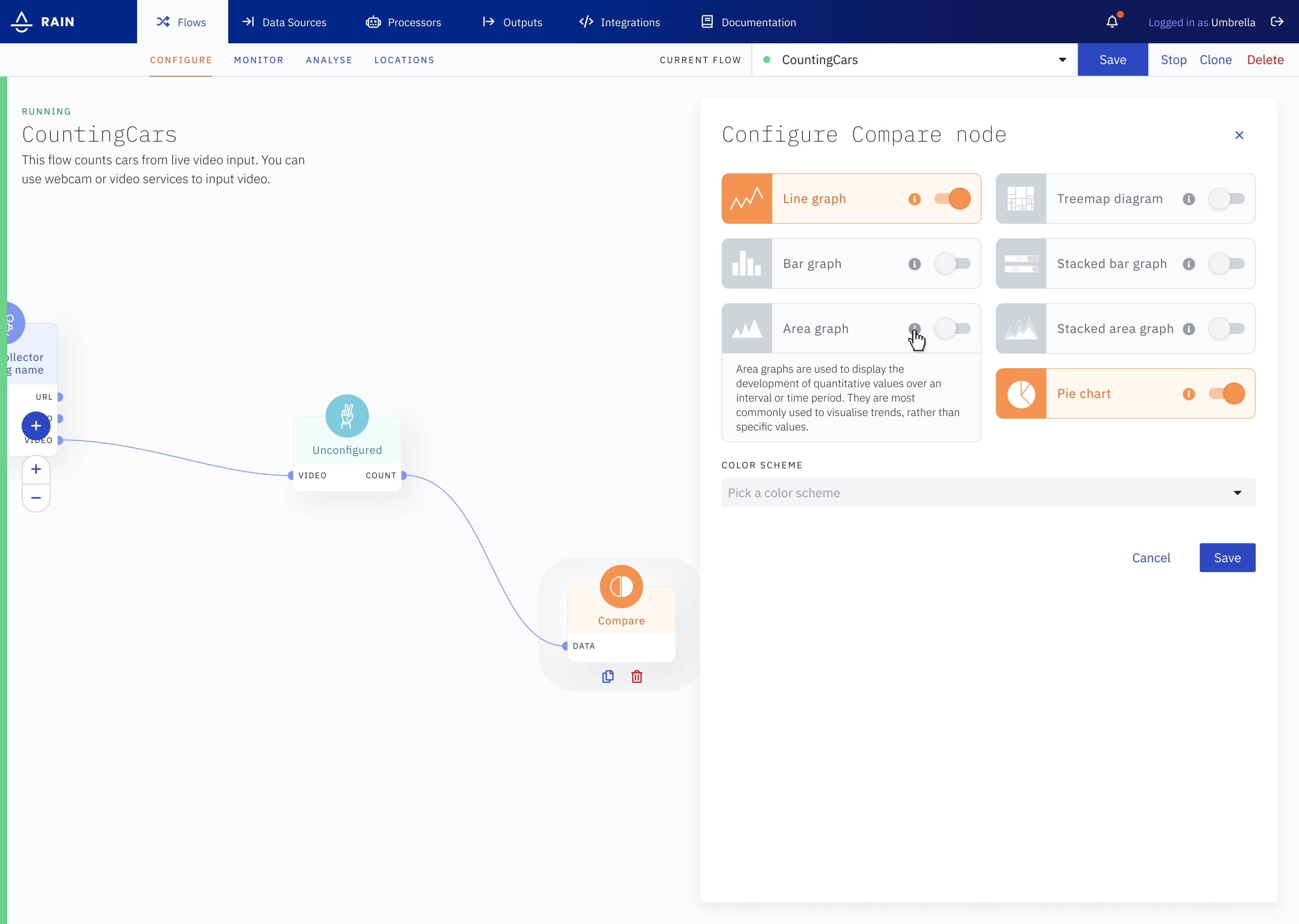
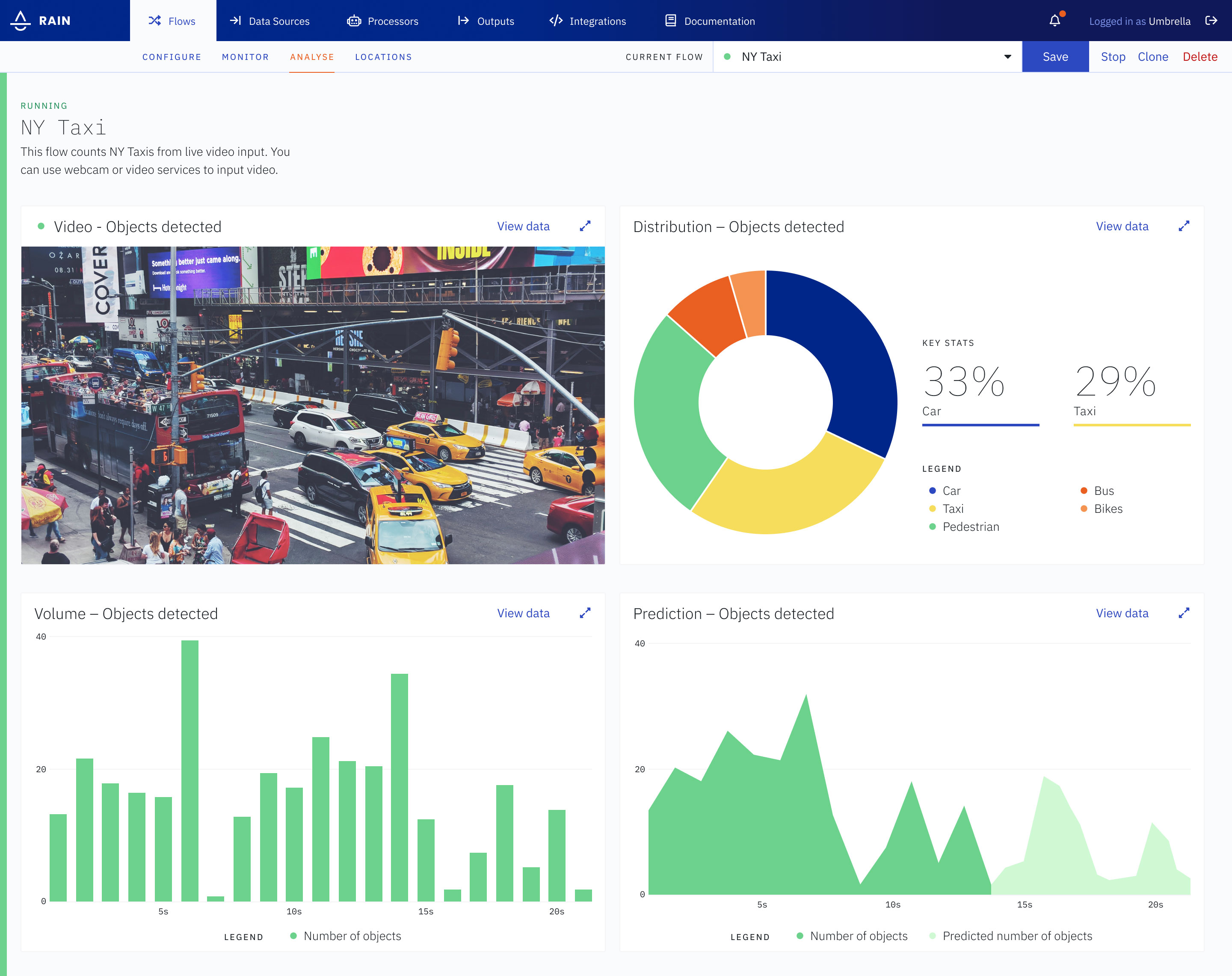
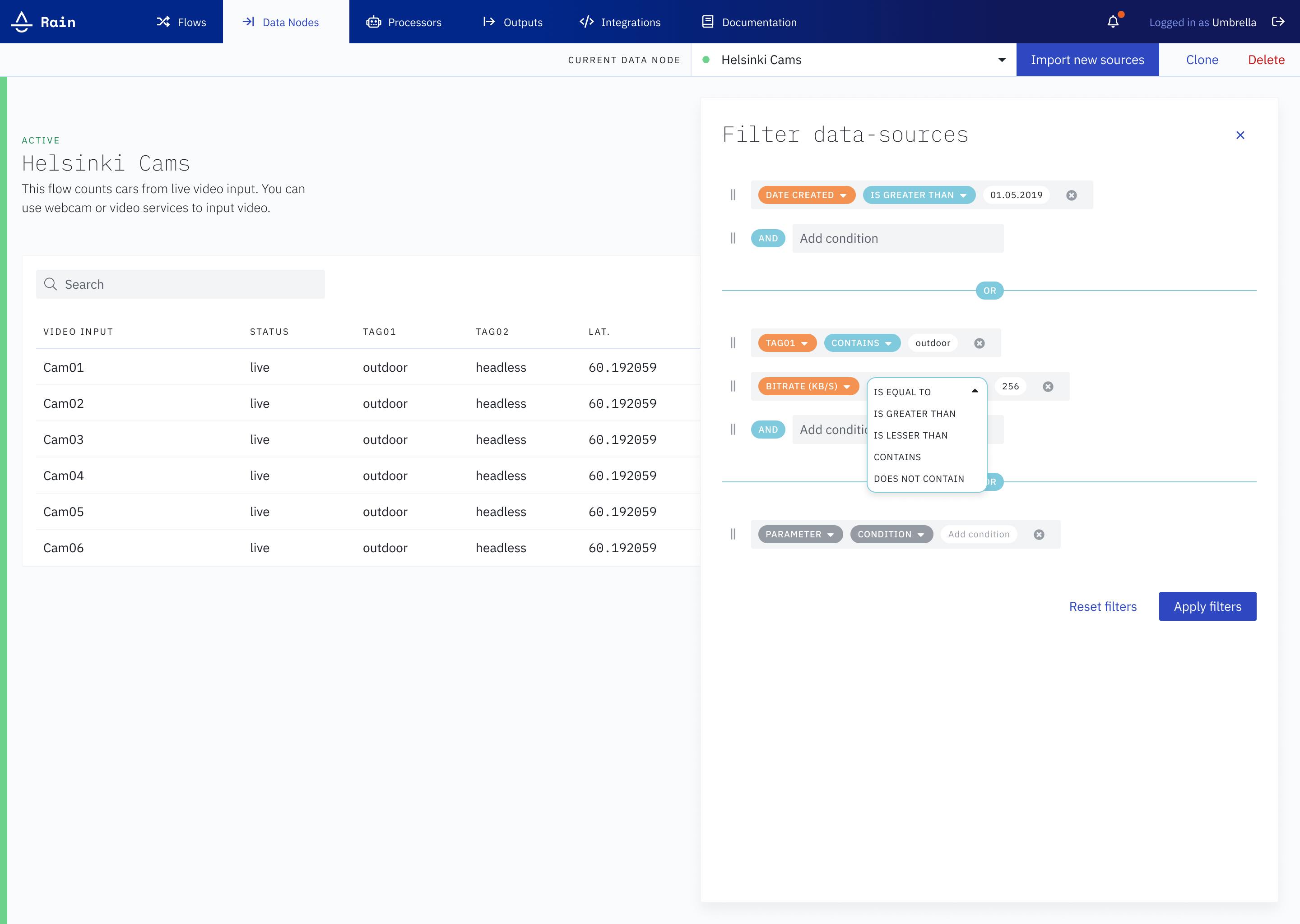
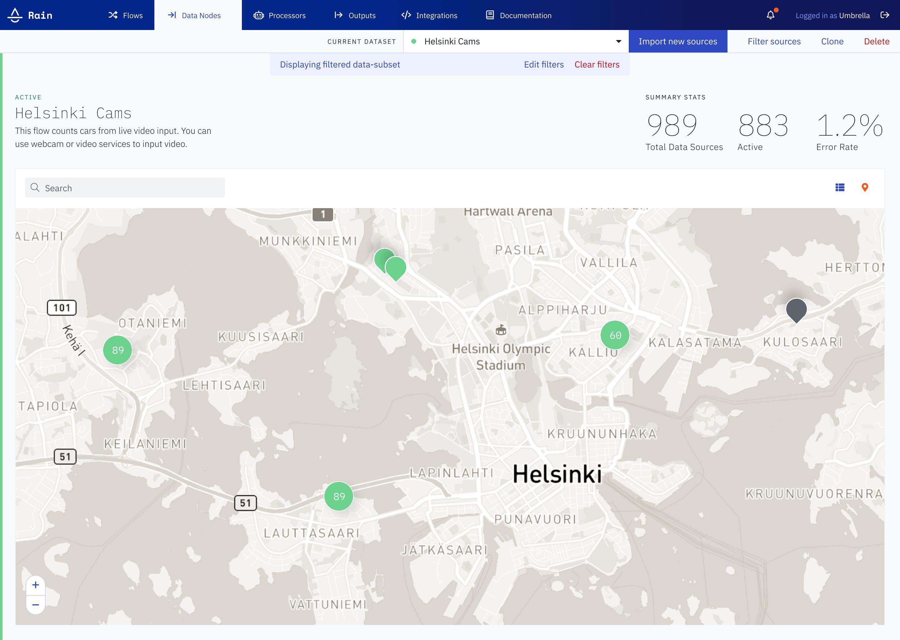
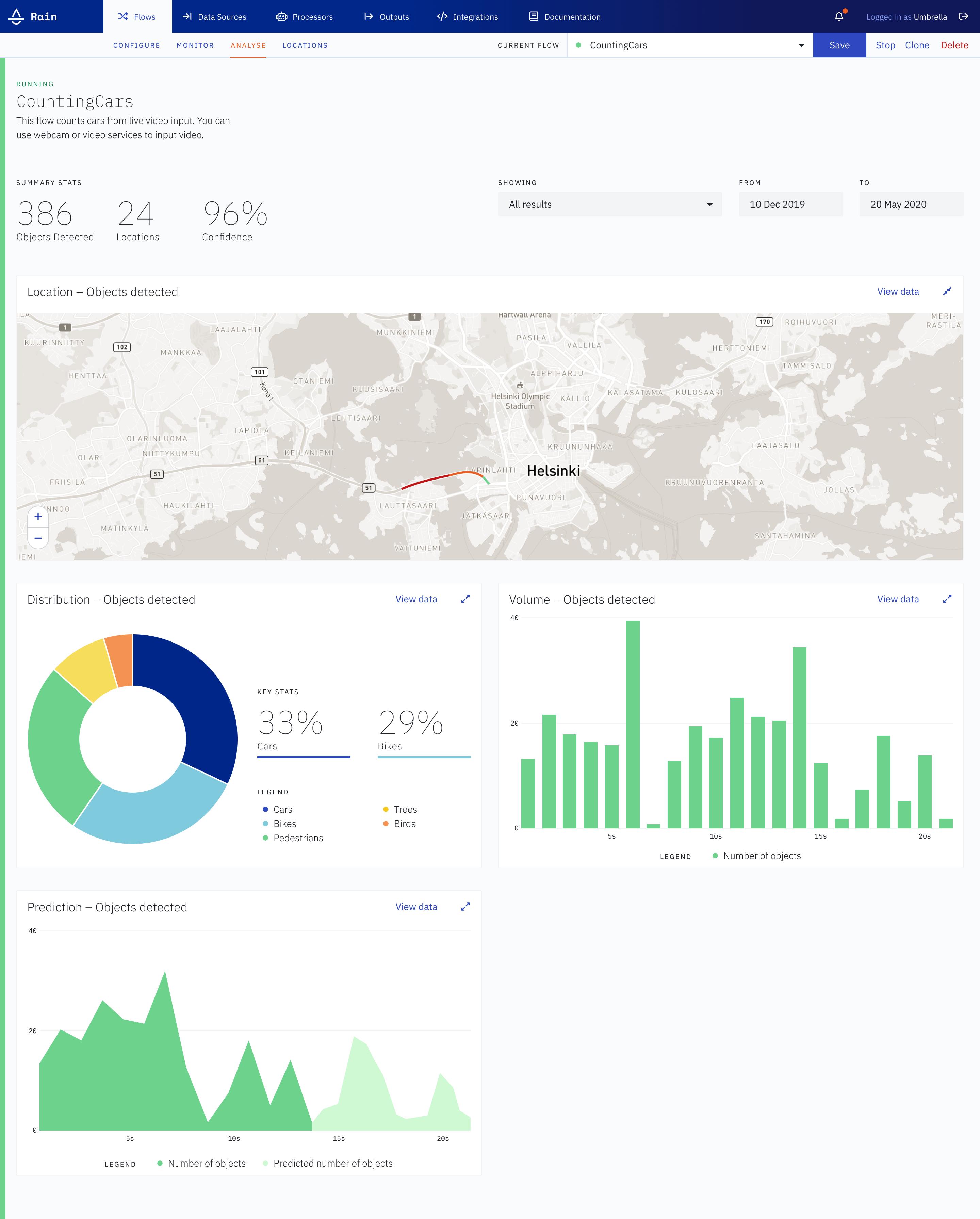
Data-applications consist of nodes that can be strung together and configured to create anything from a video object-detection pipeline, to an application that monitors heavy-machinery in a factory.
Data-applications are complex, and their UX is frequently complicated
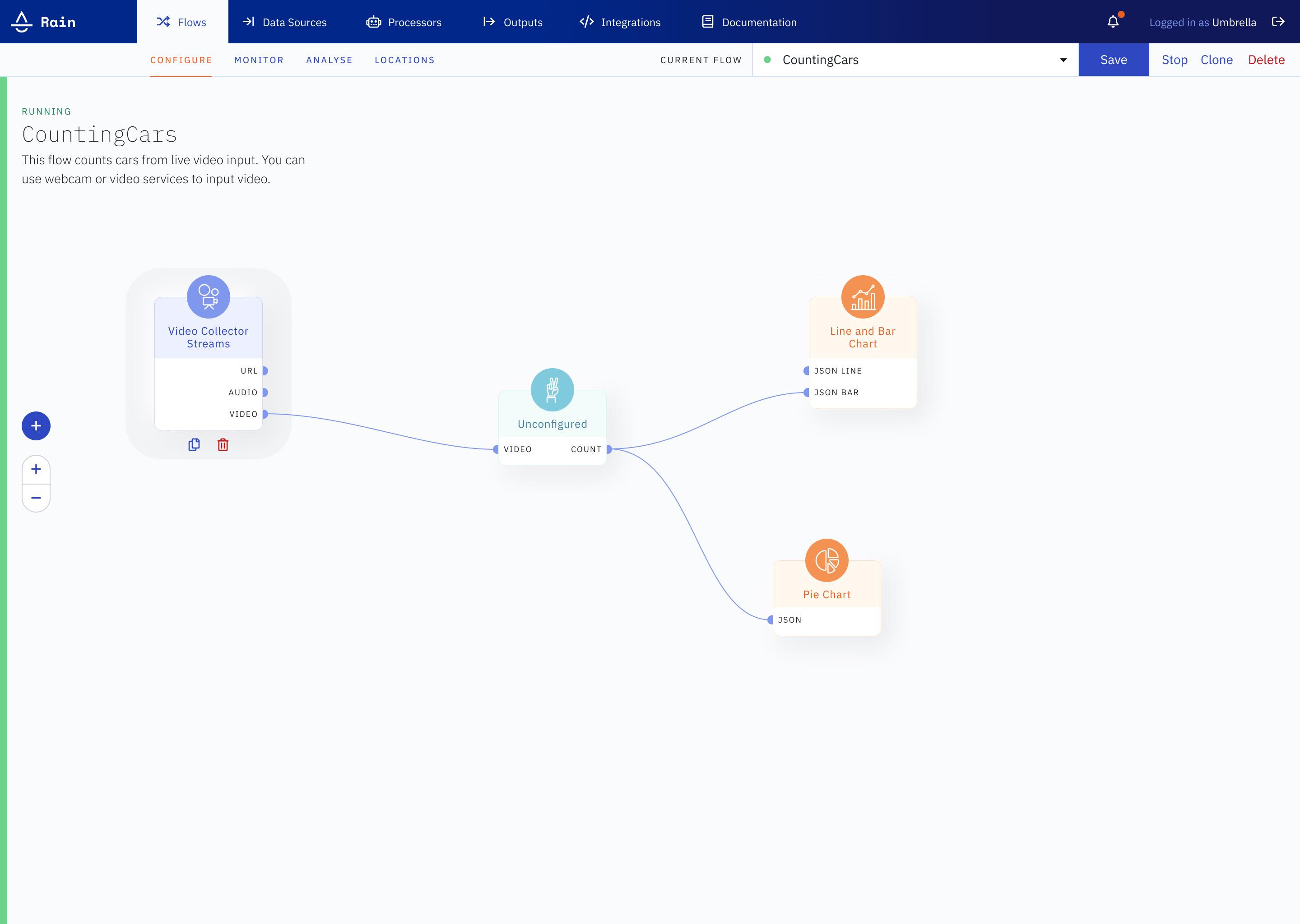
RAIN’s emphasis lies on making data-applications easy to build and deploy, through the use of a visual drag-and-drop interface. Featuring a large library of nodes, RAIN also makes it simple to import custom nodes.
Data-applications made easy
No other platform makes it quite as easy to connect edge and cloud data, create real-time data processing applications, and start making AI-assisted business decisions as RAIN does. The design allows users to accomplish some extremely powerful actions, simply. Data analytics is as simple or as granular as needed, and everything can be exported / plugged-in to external services / APIs.
Simplicity is difficult. Powerful is easy.
In the absence of a large cohort of users, key design decisions are heuristically evaluated. User feedback is incorporated through frequent iteration and user-testing loops.
Lightness of RAIN
The RAIN outlook is light and closely associated with water. A primarily blue and grey palette with lots of white defines the colors, and the IBM Plex type family provides the typefaces. Maintained as components in both Figma and React, the system is an evolving entity. At its basis, it defines design tokens that informs higher order styling and interaction.
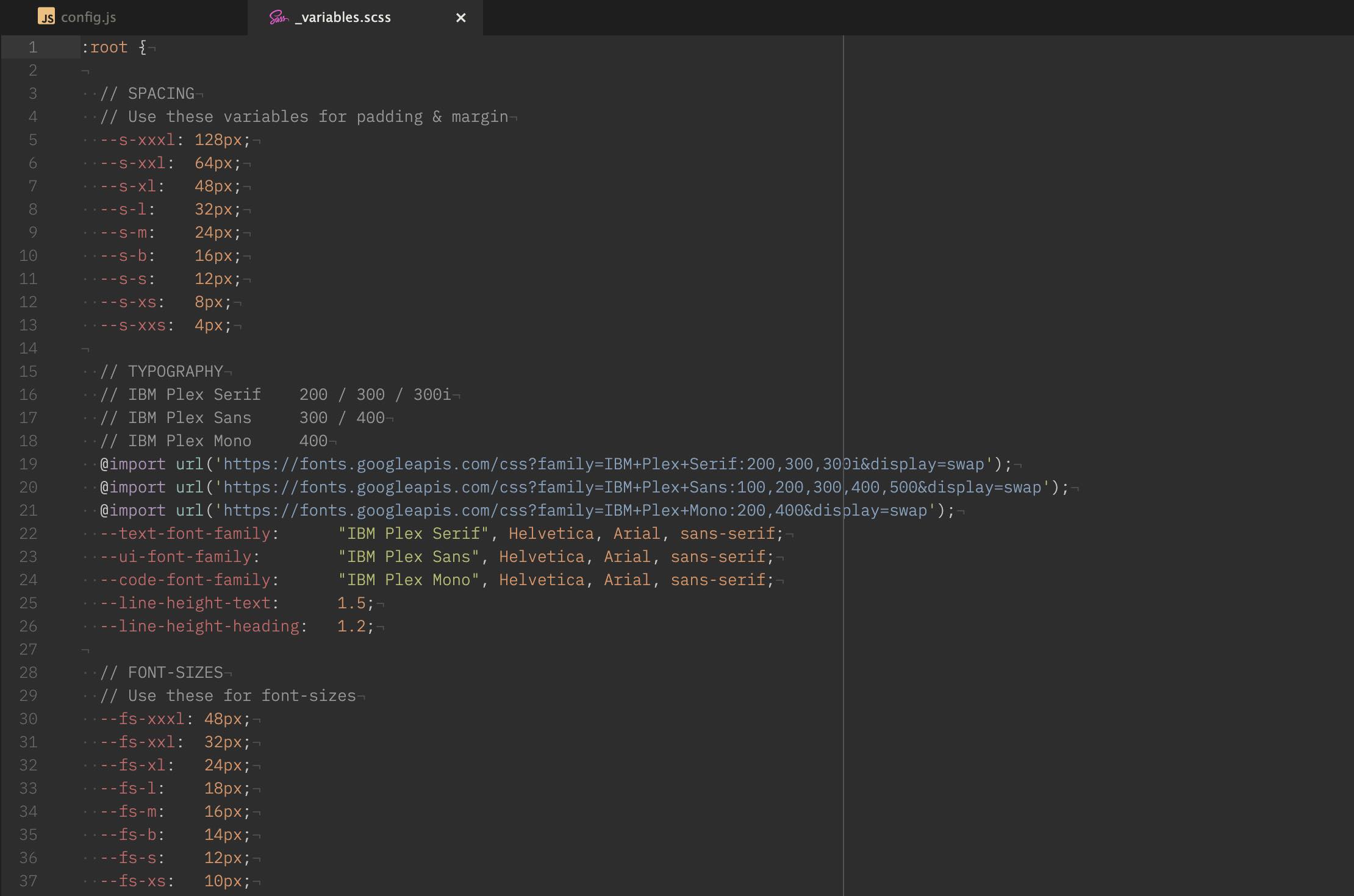
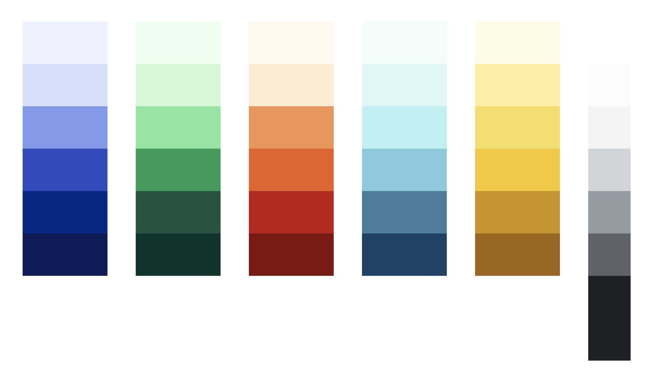
Tokens and spacing defined in Figma & CSS-variables are the basis of RAIN’s design system
Design tokens of color, spacing, type, sizing, radii, borders, shadows and timing functions are defined as CSS variables. This makes them easy to include in components, and also easy to override for exceptions. The same tokens are used across the application, the marketing website and the documentation microsite keeping the visual feel aligned. All components align to an 8px grid, and keep accessibility guidelines in mind.
Being responsible for the overall branding efforts, one wishes that industry-standard slideshow software would also work with design tokens and variables.