Bryk & Wirkkala at EMMA
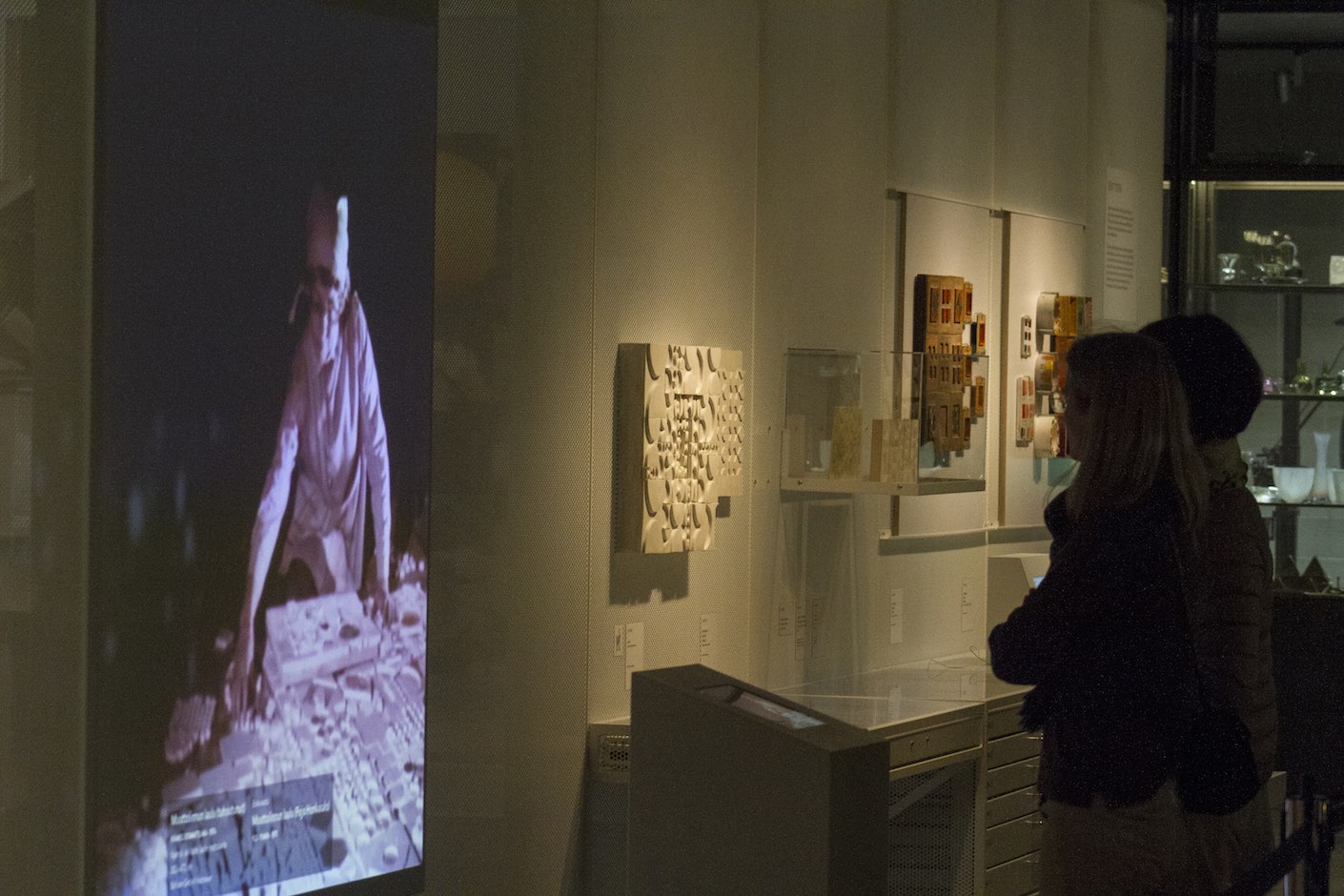
I was approached by EMMA to conceptualise and create digital interfaces for a museum extension housing the archives of Rut Bryk and Tapio Wirkkala. The space was conceived as an exhibition-space and visible storage with objects and spatially experienced digital content. Home to more than 5000 physical exibits, and digital archives featuring over 1700 virtual exhibits, the space opened on 17 November 2017 with Still / Life – Tapio Wirkkala Retrospective. It was a delight working with EMMA and its staff, and since I’ve heard only positively from them, I assume it was a pleasurable experience for them as well.
How to explore over 1700 hi-res images of artworks and press-clippings on an iPad?
A video of the finished interfaces (1:10m onwards)
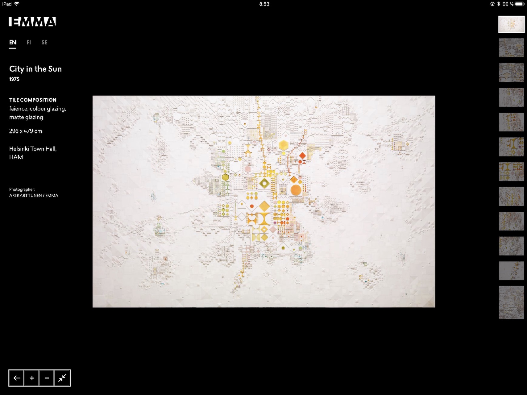
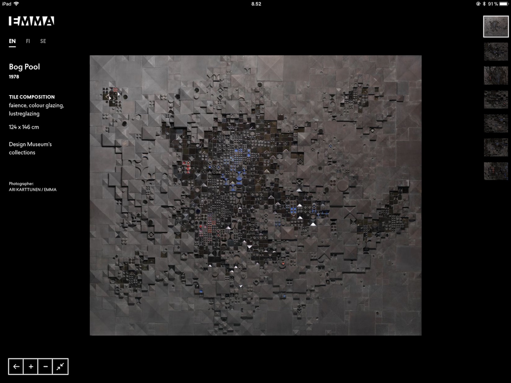
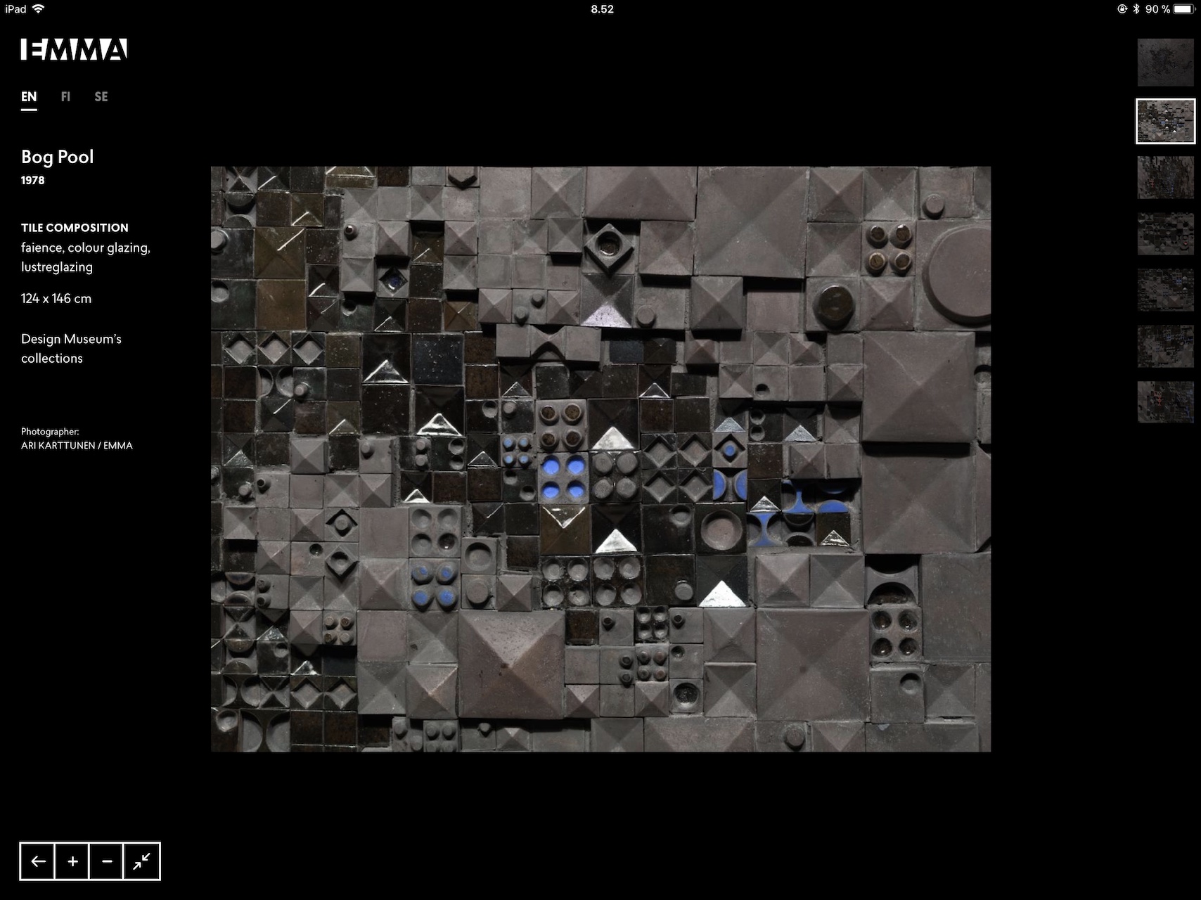
Bryk’s Monumental Artworks
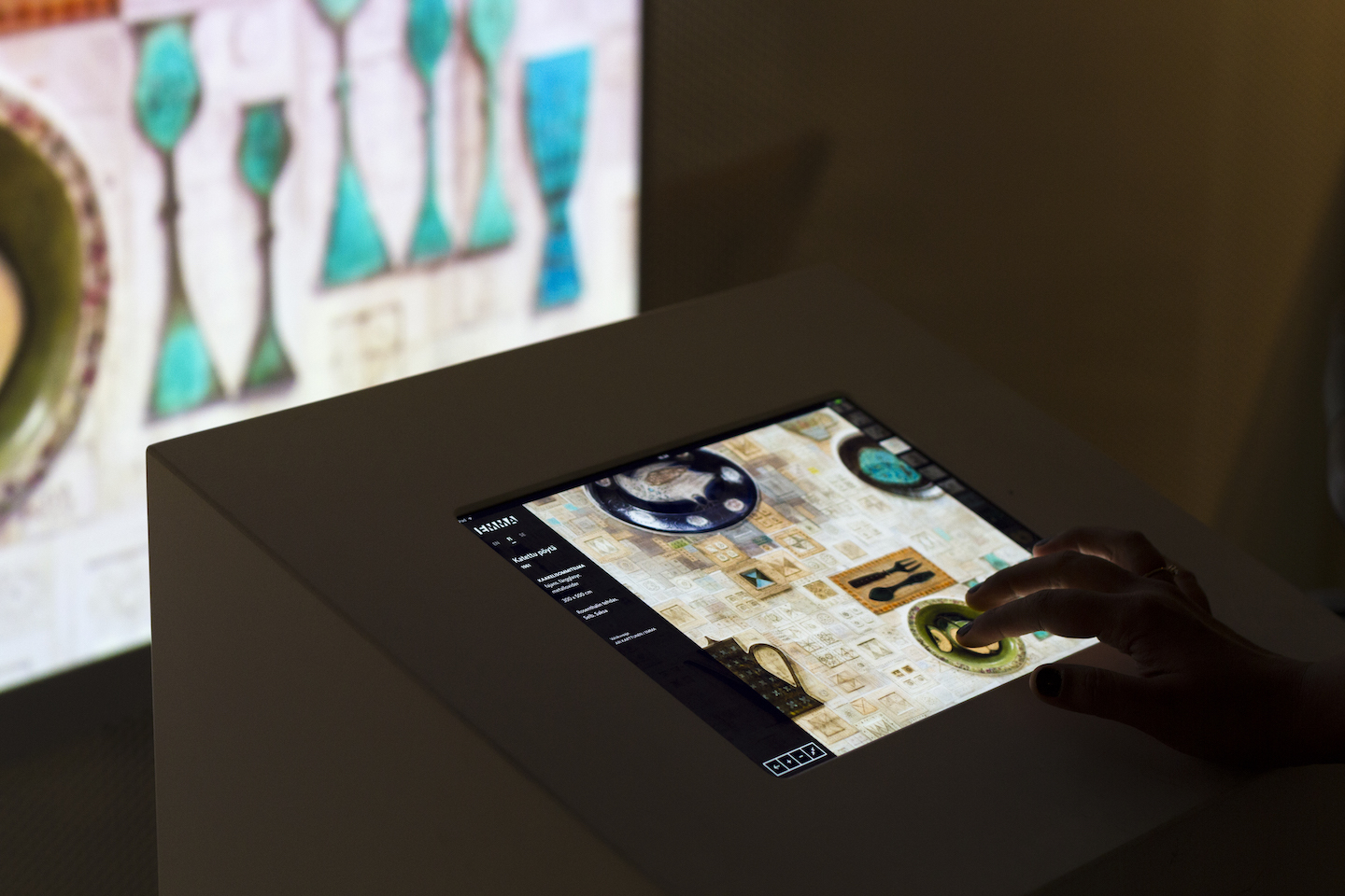
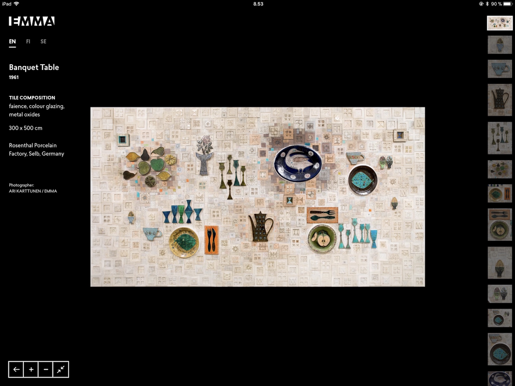
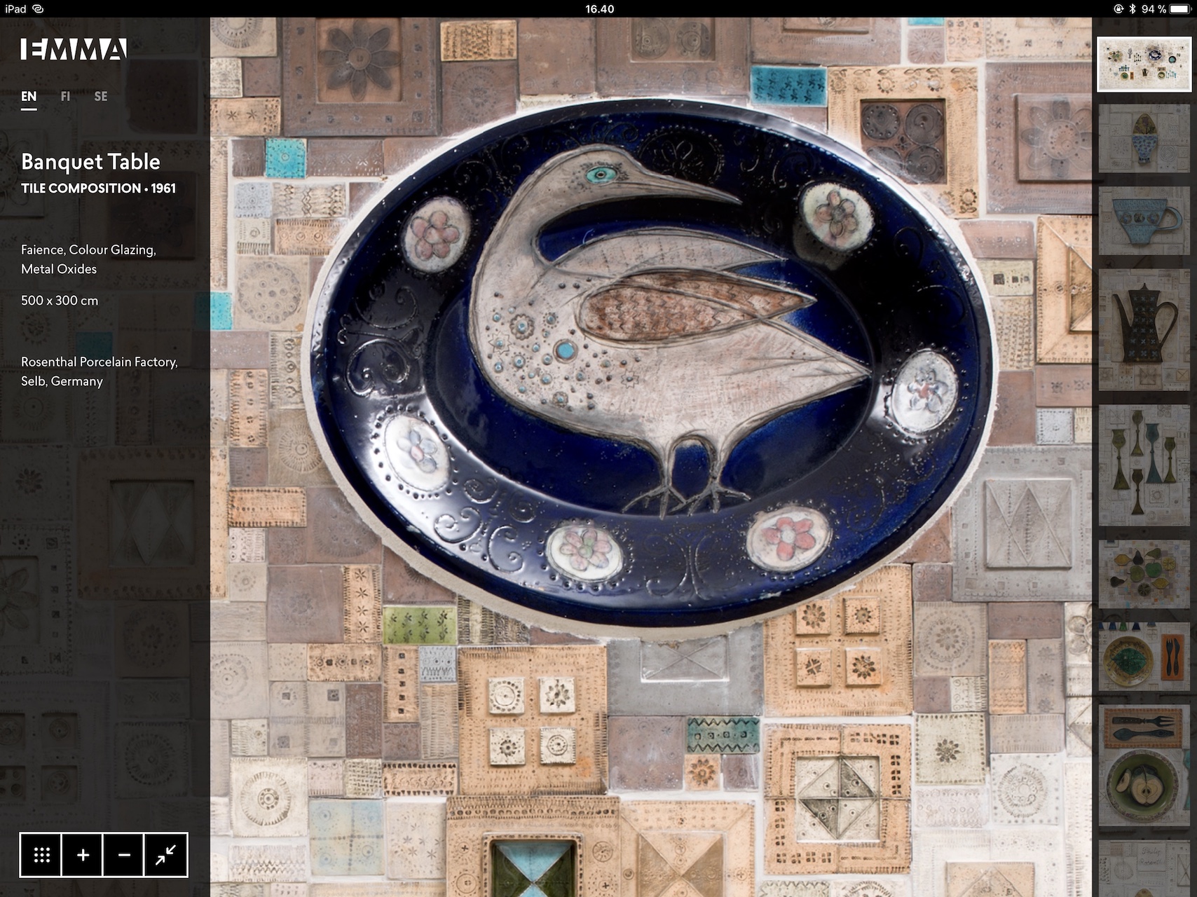
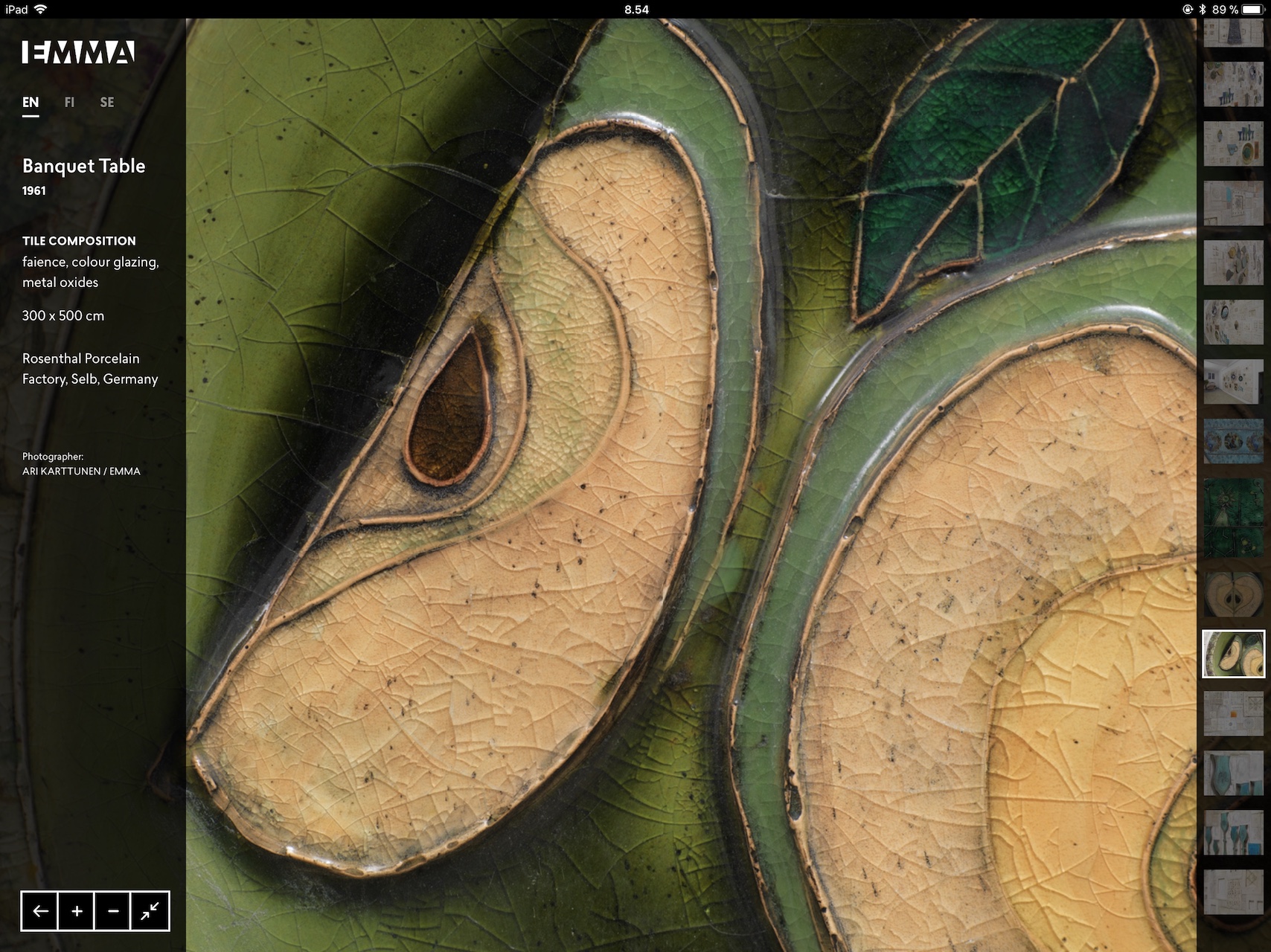
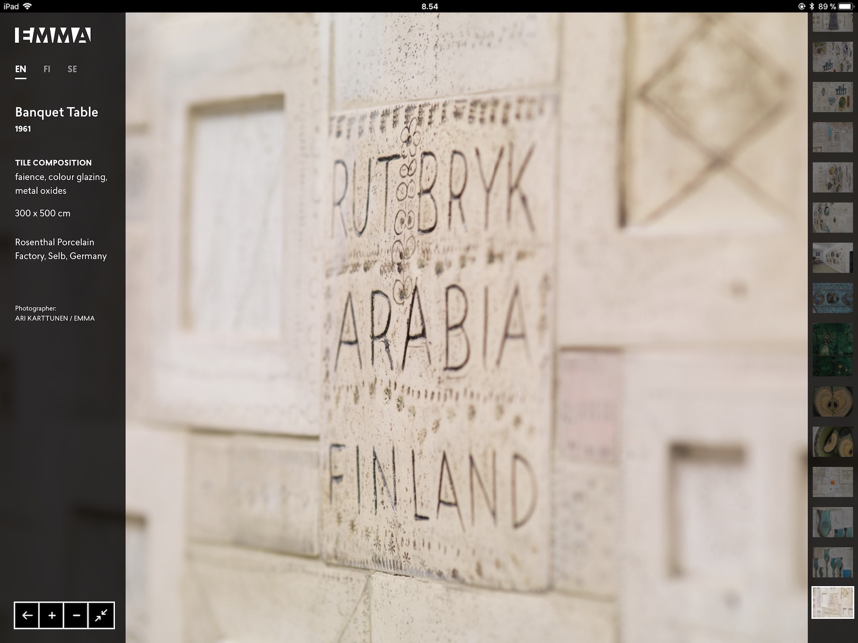
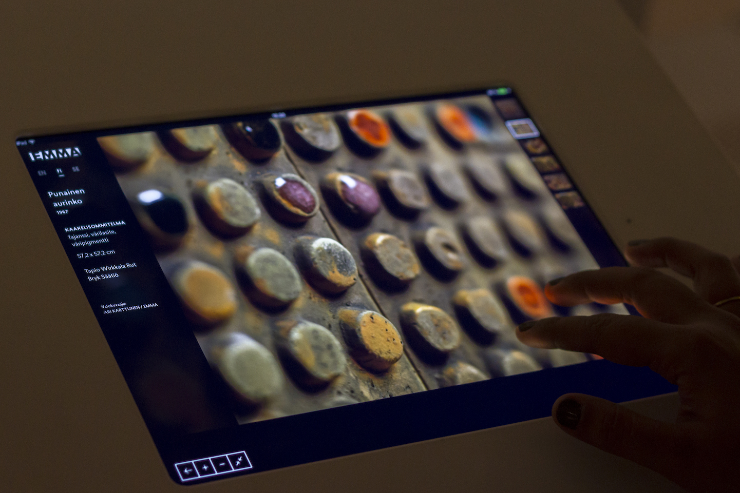
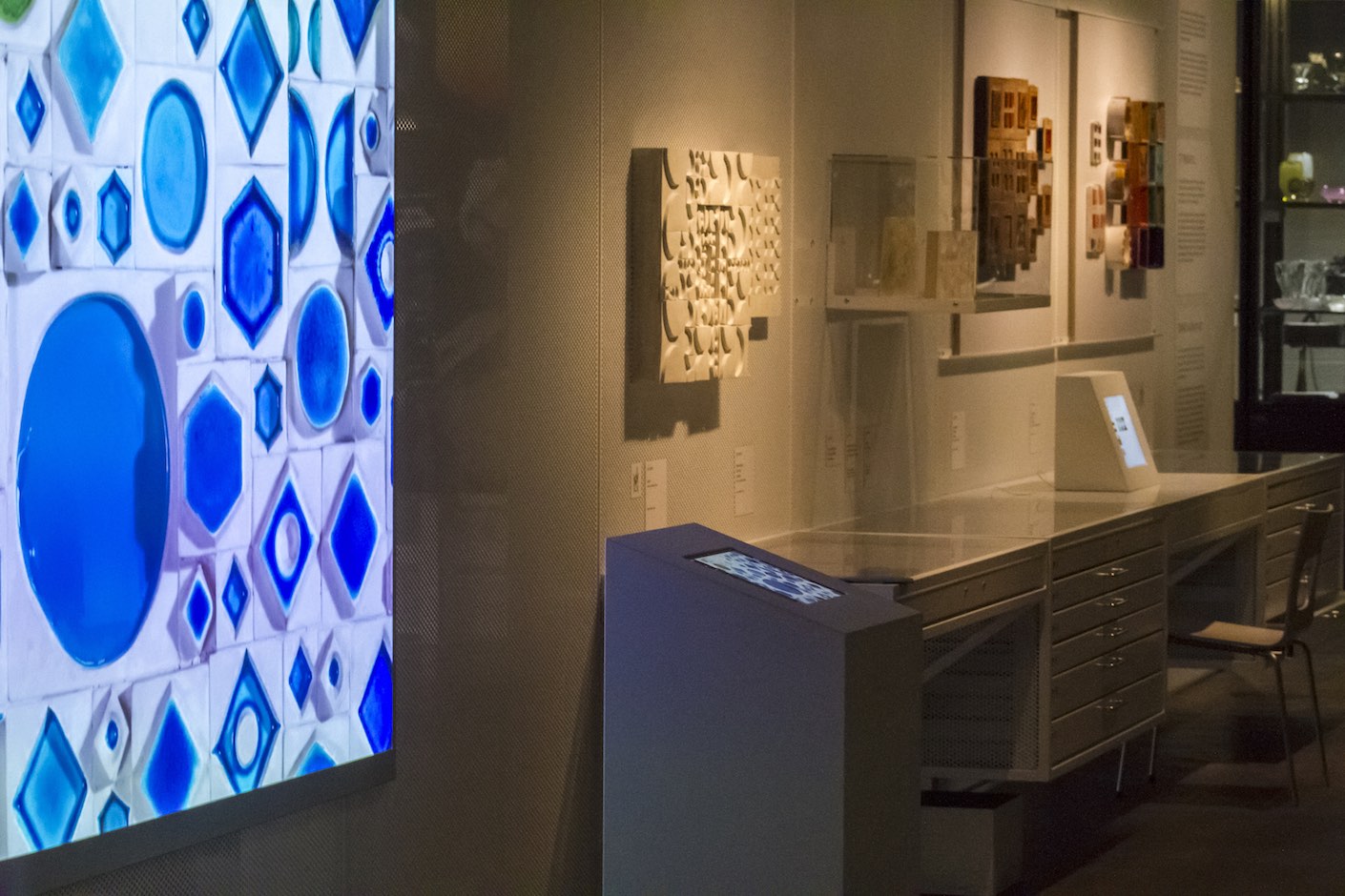
The user is drawn into the large scale ceramic artworks of Rut Bryk through this multilingual interface. The high-resolution imagery is synchronously projected onto the wall in front, magnifying is further. A museum visitor is able to enjoy the details closer than you can in the real artwork. The design of the final interface was dark and minimal on purpose: to immerse the visitor in the content being served while providing all the necessary controls for navigation and zoom, and preventing excess light-bleed in the exhibition area. When not being interacted with, a video screen-saver shows Bryk at work. Most importantly, the interface needed to cater to all visitors.
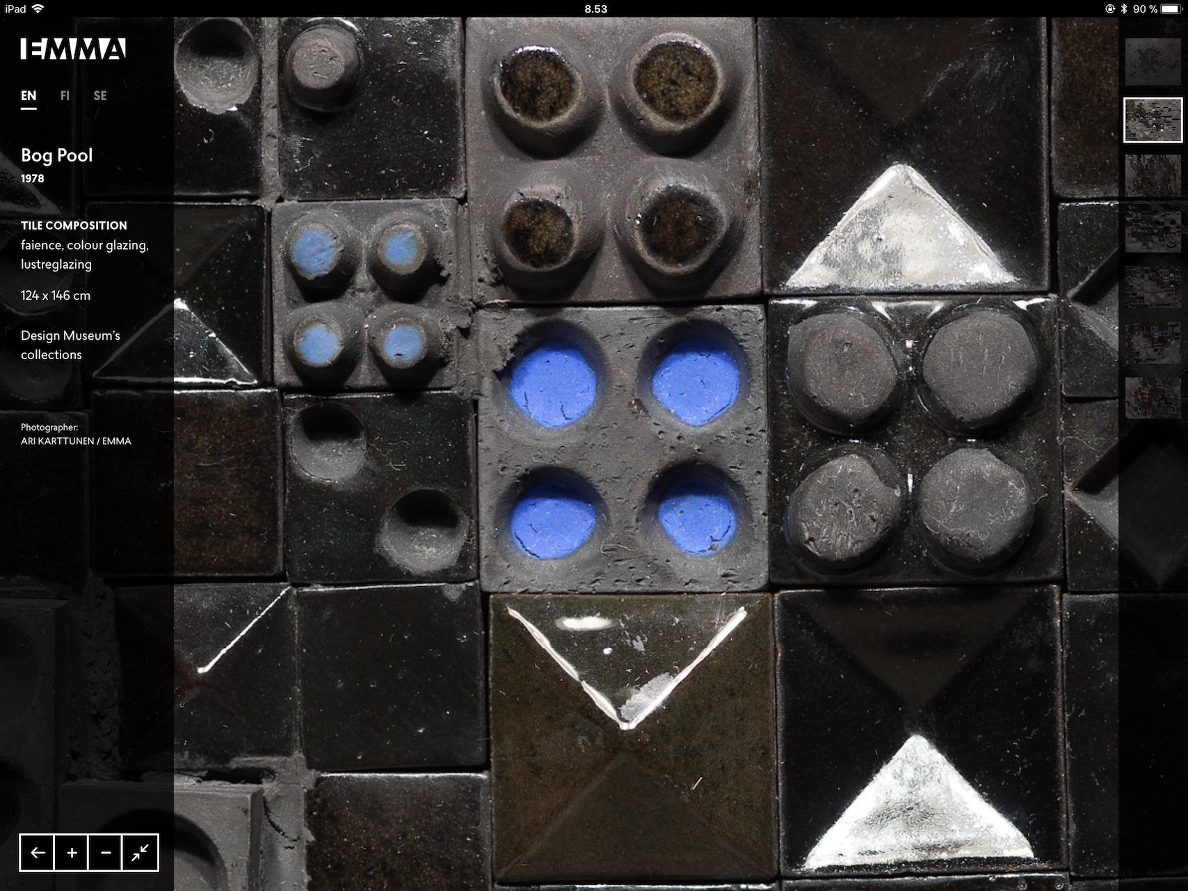
All touch-affordances were replicated as clear buttons for ease-of-use
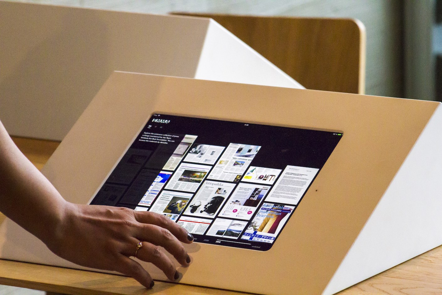
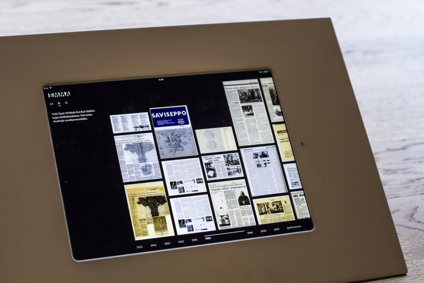
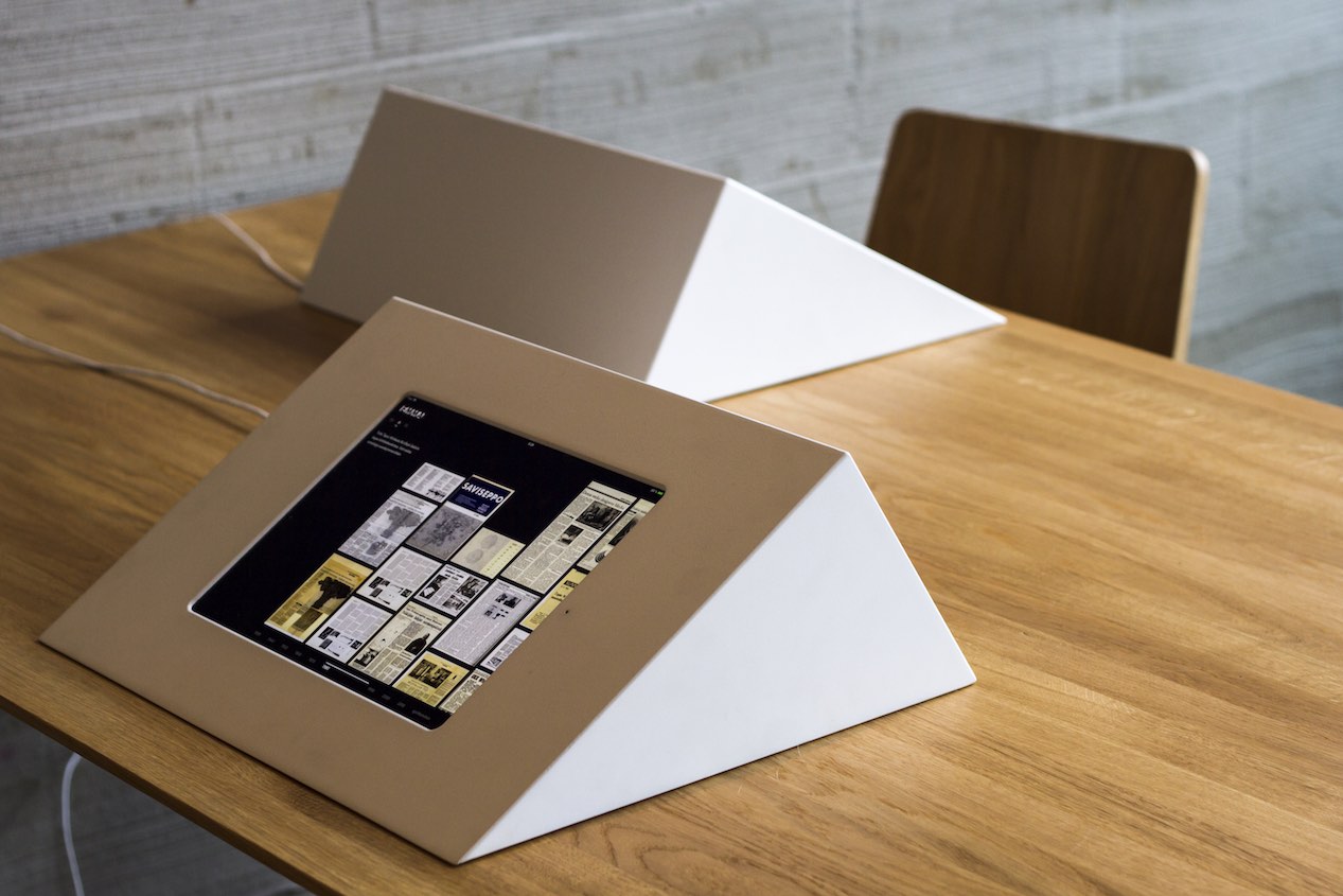
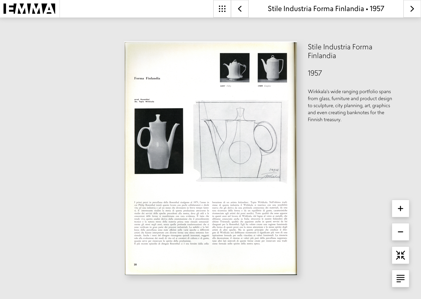
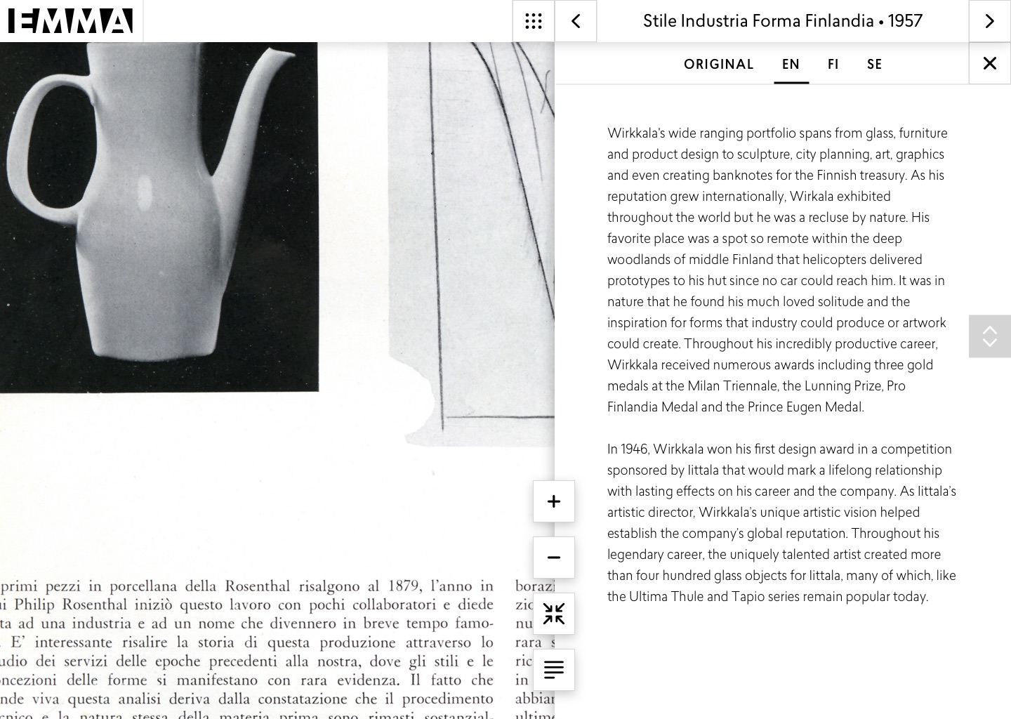
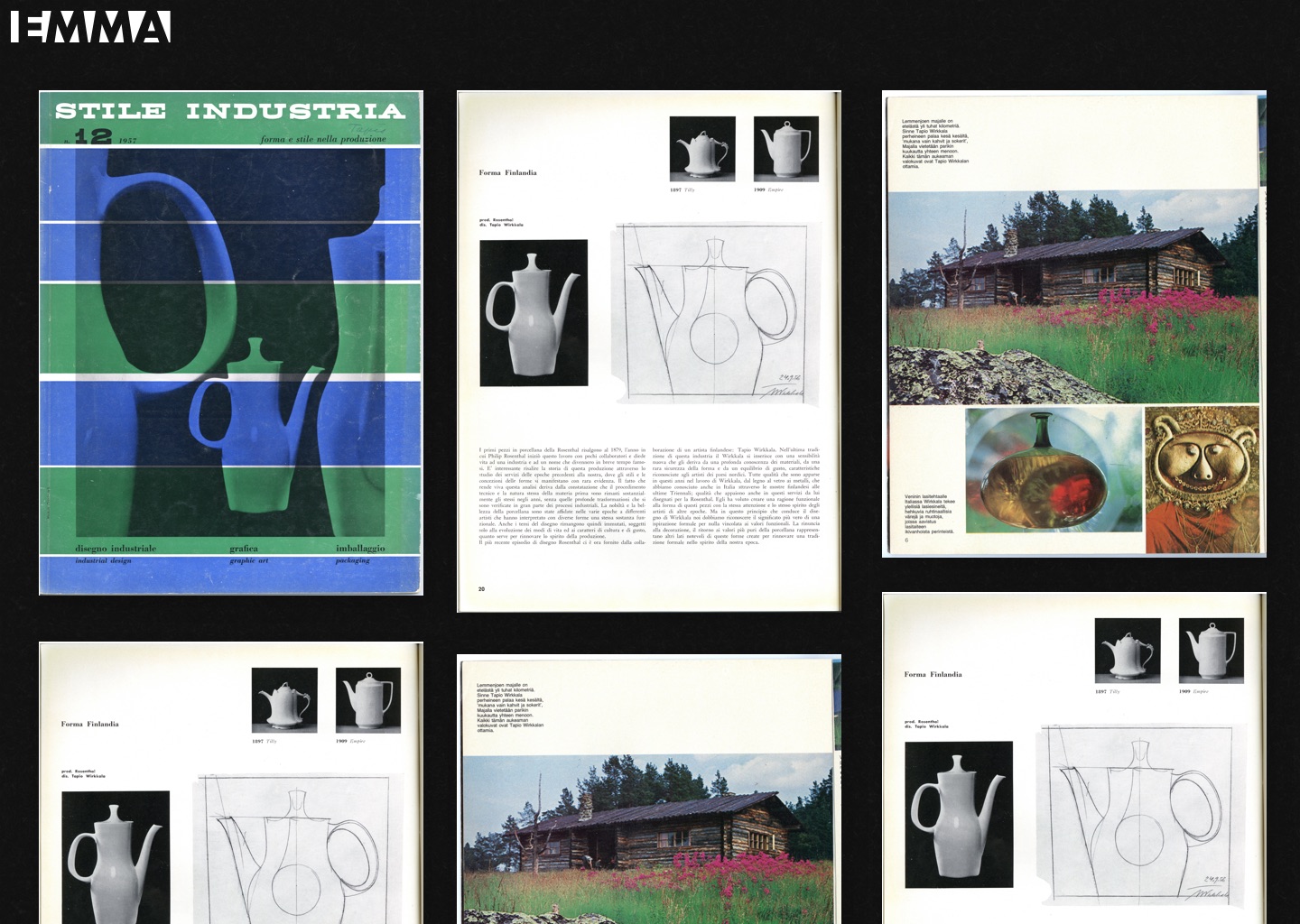
Bryk & Wirkkala press archive
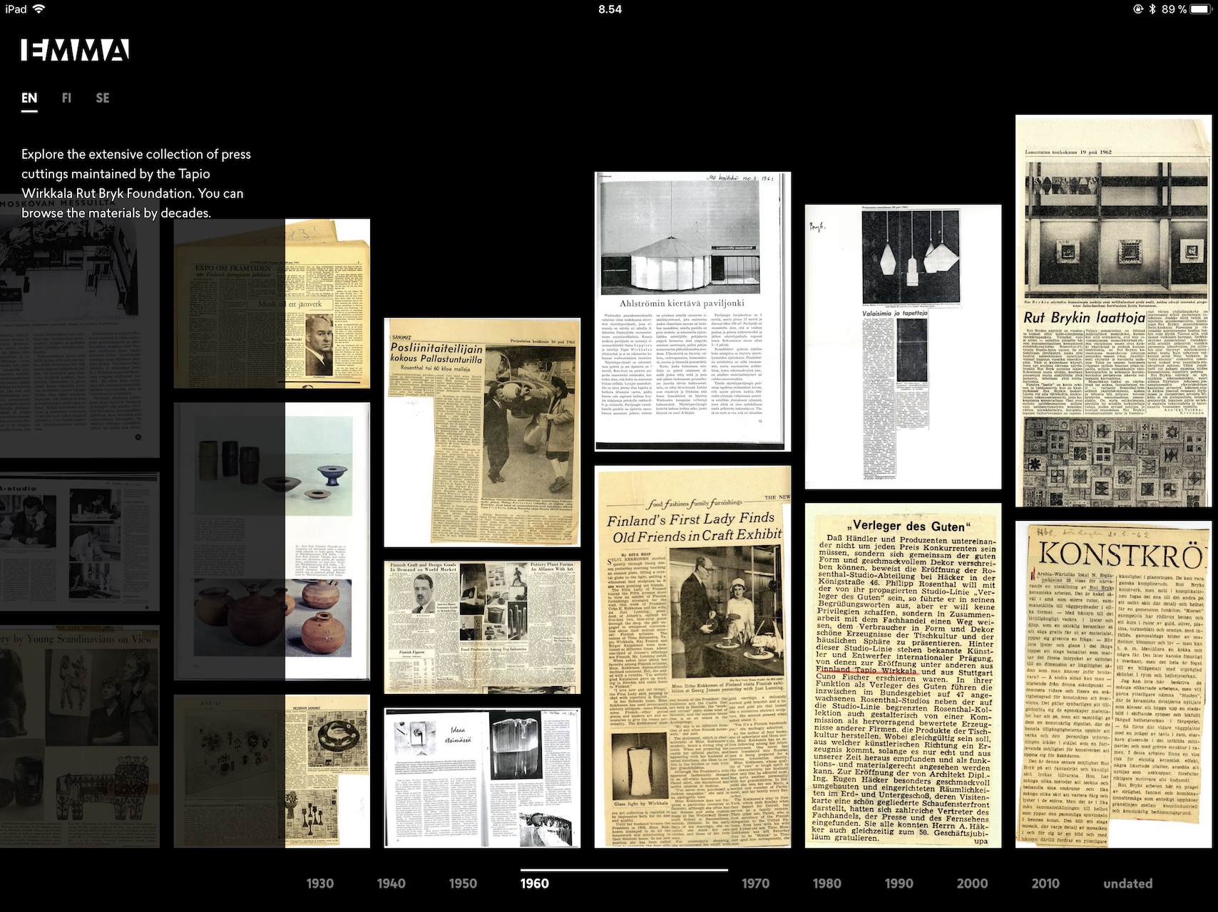
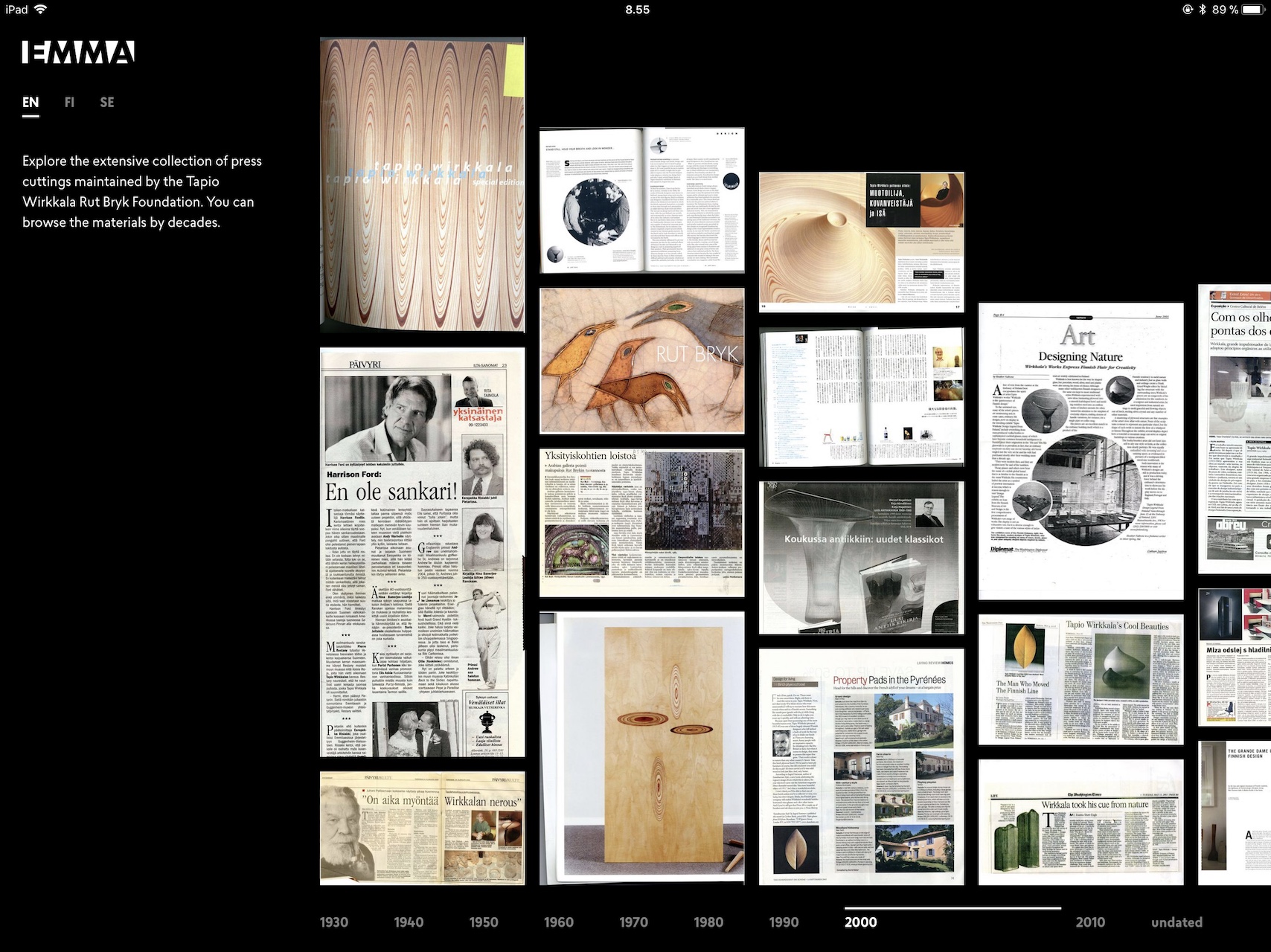
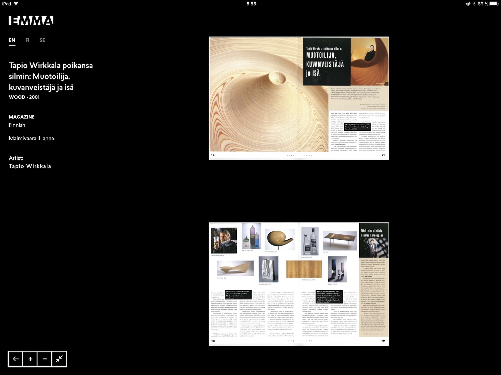
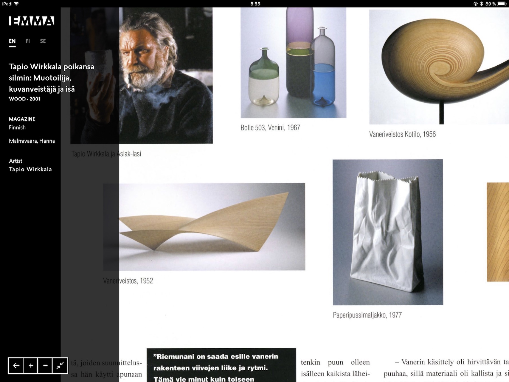
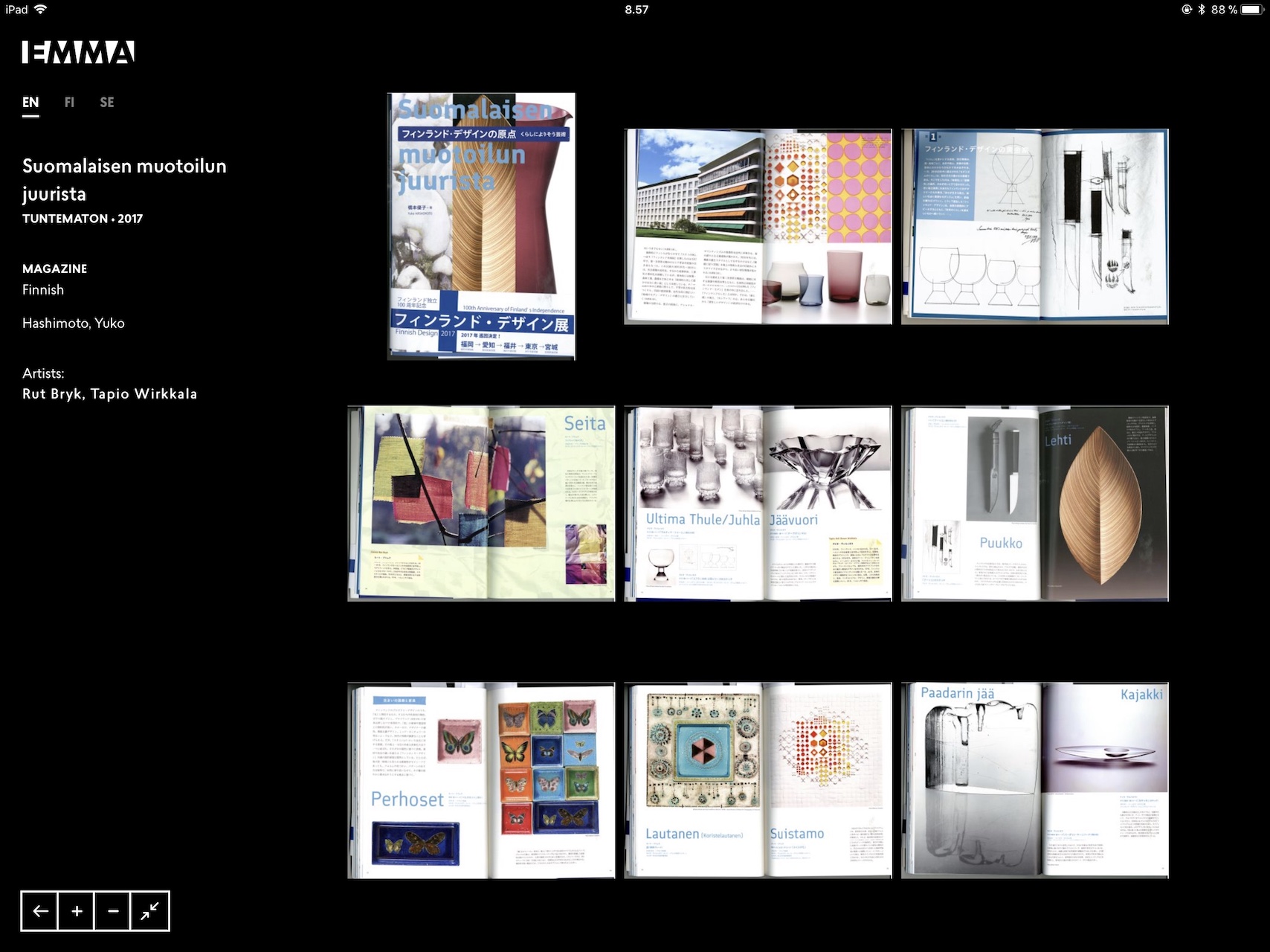
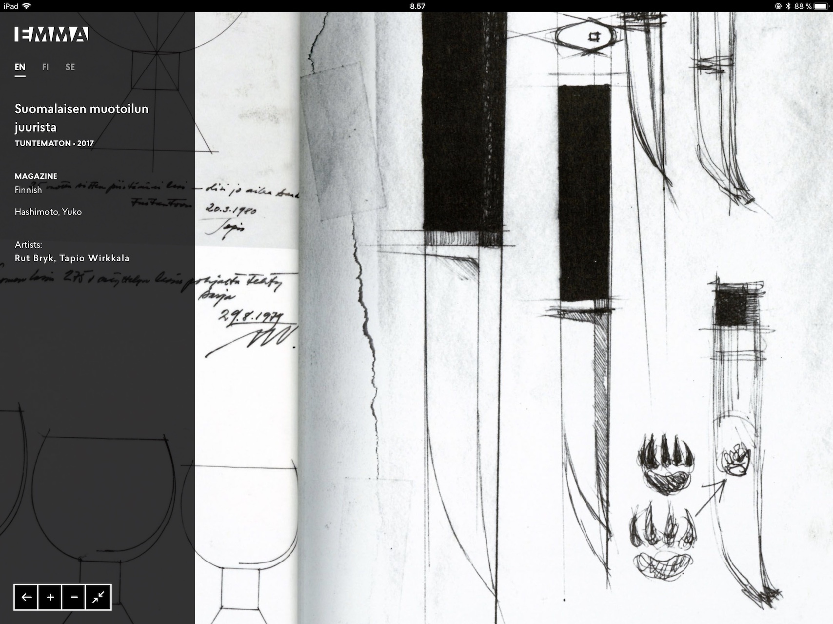
Browsable archive of press clippings of Rut Bryk and Tapio Wirkkala over the decades. This UI required solving multiple technical challenges to work smoothly on an iPad. Thumbnails were displayed a decade at a time; high-resolution scans (up to 8 megapixel) were rendered using OpenSeadragon tiles at multiple resolutions to facilitate smooth zooming in/out. All image processing was automated using a custom Node.js script. This was by far the most challenging UI of the three to implement.
Ever tried displaying 8MP images in iPad Safari?
It downsamples it to 1MP so details are lost when zooming in!
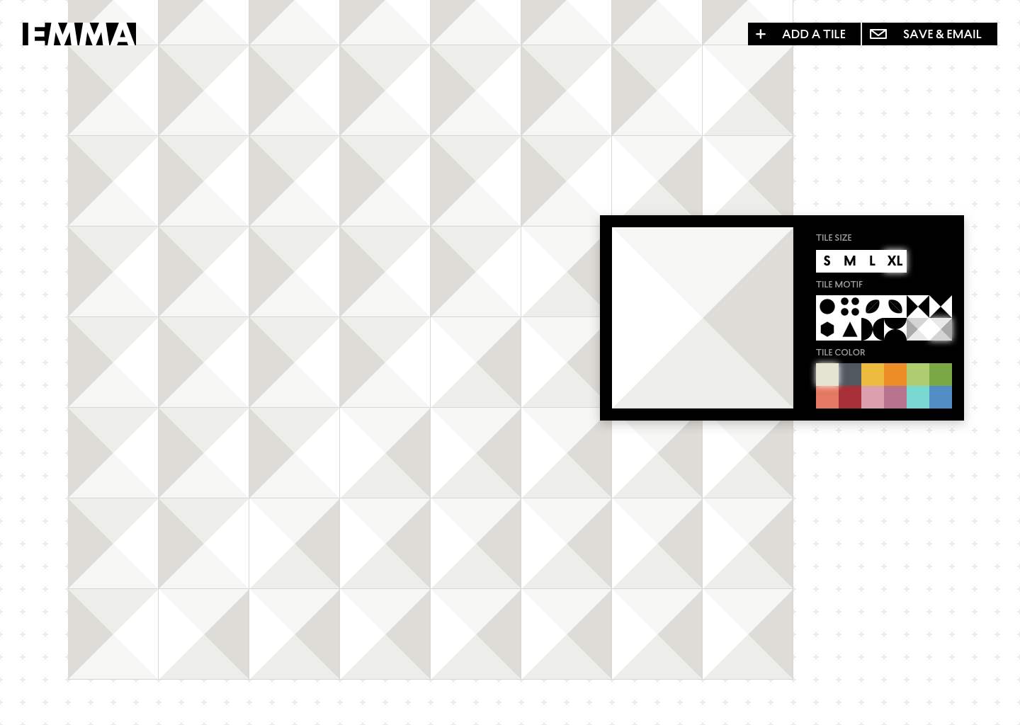
Build your own artwork à la Bryk
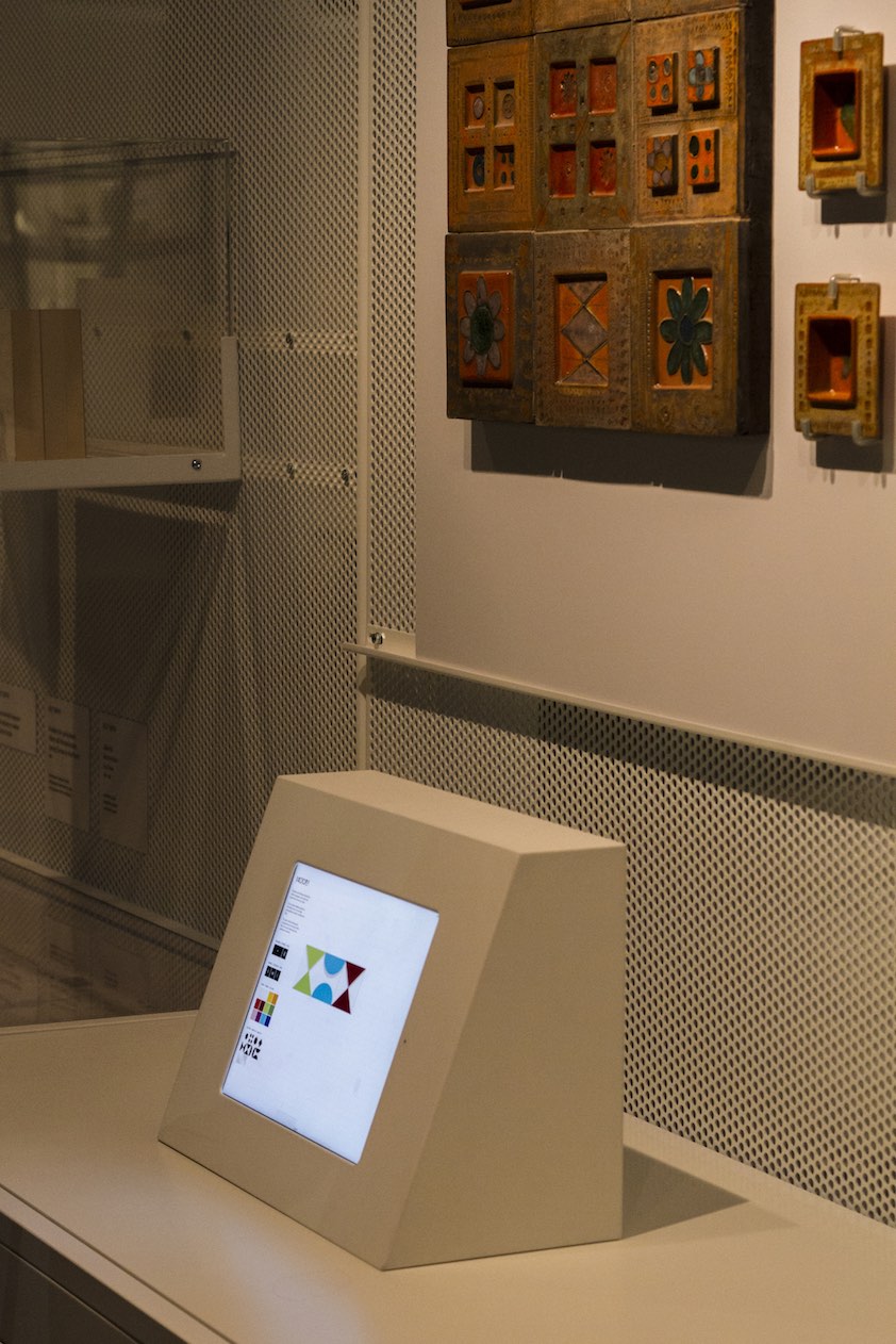
The compositional interface was conceptualised as a fun interactive exhibit. It allows visitors to mix and match a few predesigned tiles (at multiple sizes / colors) to create tiled compositions in the spirit of Rut Bryk. Through the process, the visitor gets a tiny glimpse into the workflow and thought processes of the artist. From initial design to final implementation, not much changed. Some features were dropped because the interfaces were offline (so the compositions couldn’t be mailed, for example).
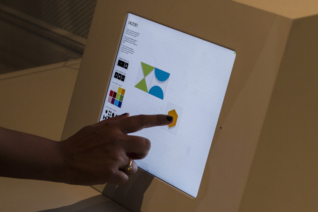
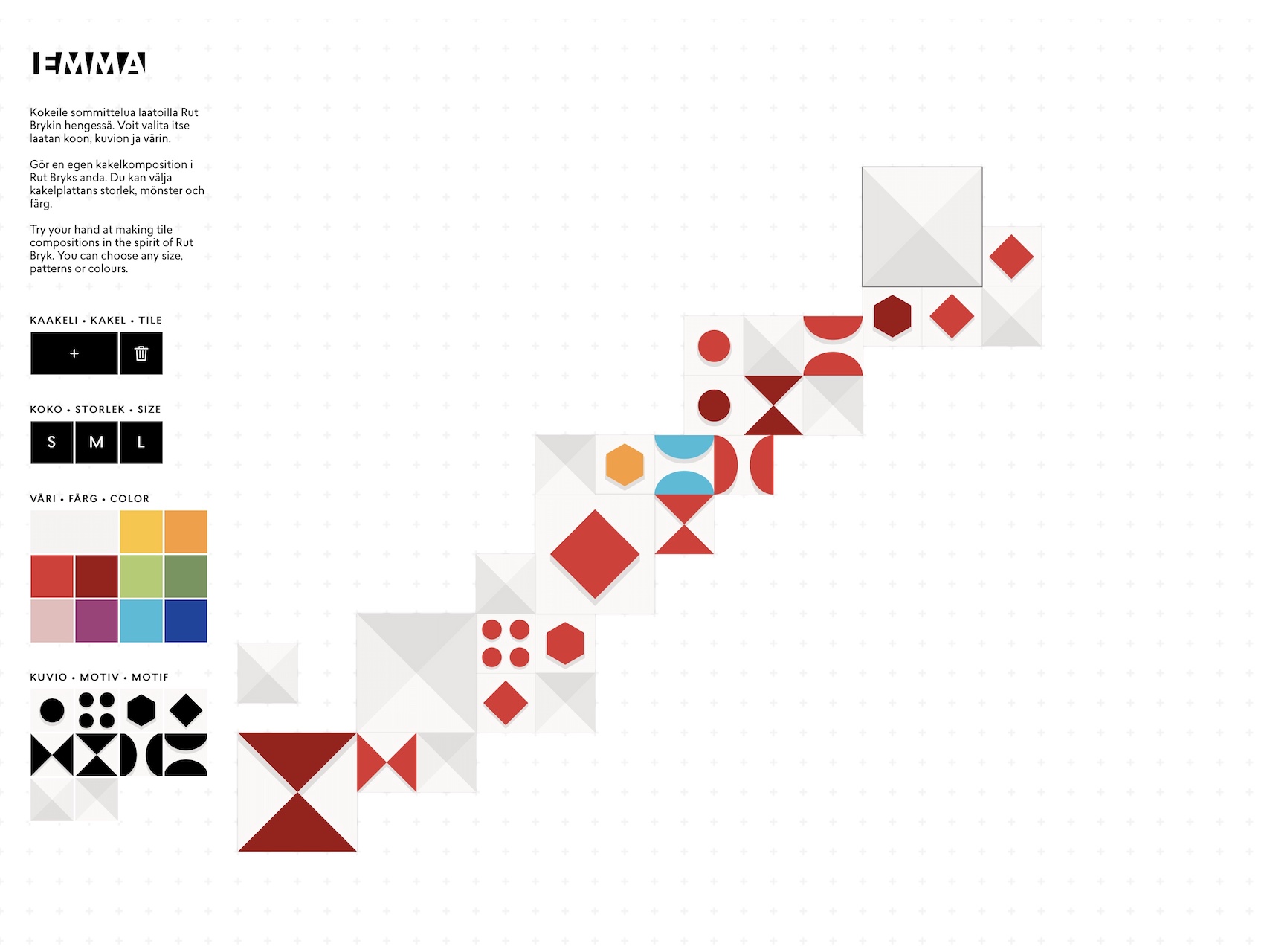
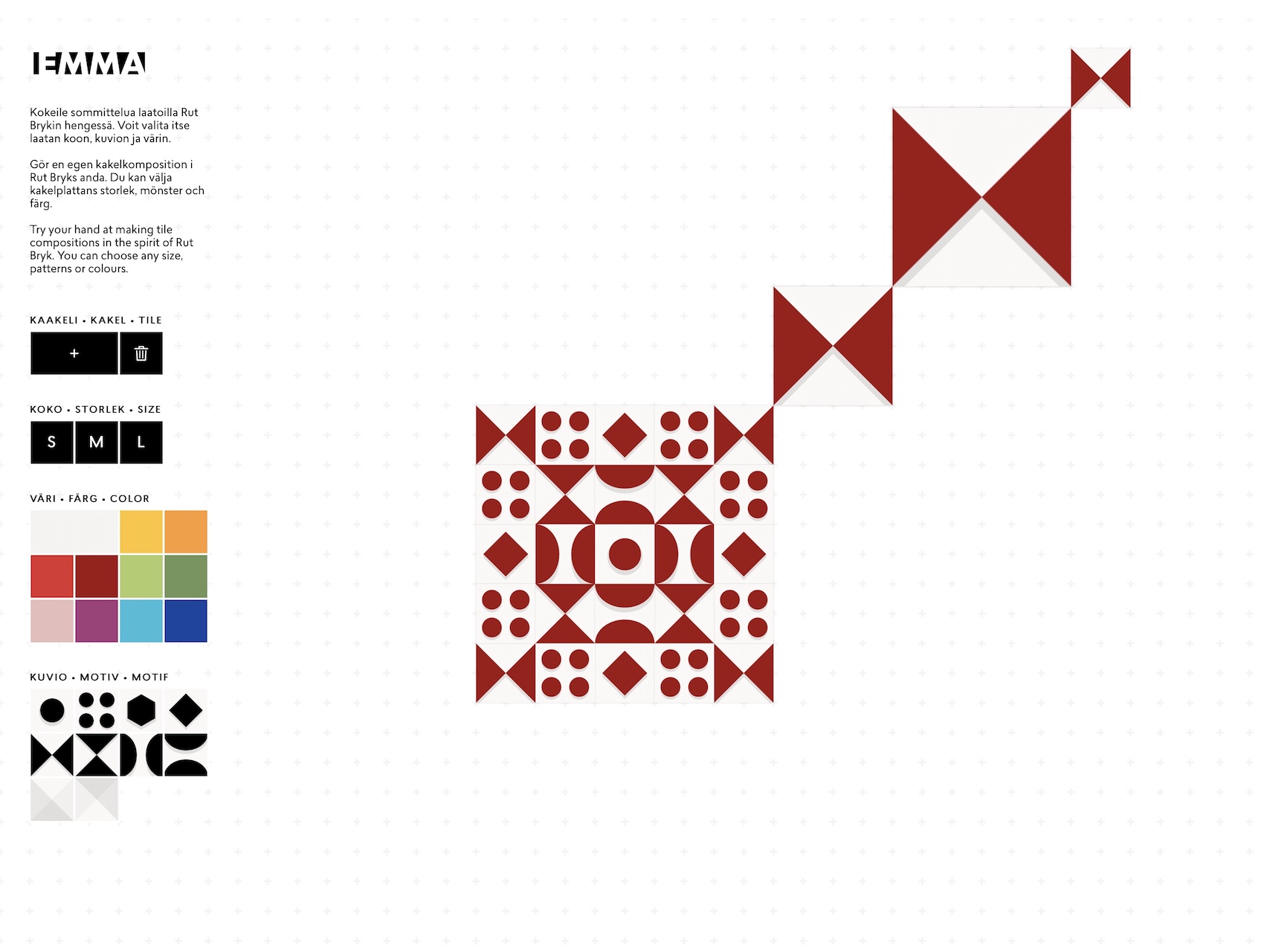
The younger and the older visitors enjoyed this tile-game, and played with it for hours. Much to our delight!
How we built it
The project proceeded simultaneously on design and implementation. Conceptualising and design was done collaboratively over multiple sessions with the team at EMMA, placing special emphasis on accessibility. These ideas were then polished and refined as the team progressed on the design of the space, branding for the exhibition and the concepts underpinning it all. To keep things simple on the tech-front, browser-based technology was chosen. A local Node.js server kept assets synched across devices while keeping deployment and iterations straightforward. The application on the iPad would basically be a highly-optimised HTML5 page saved / pinned to the home-screen.
The central idea was to build rapidly, iterate easily and deploy lightly.
Starting out with dark on light (easiest to read), the interfaces finally became light on dark. There was to be a projection involved, and light backgrounds would bleed too much light into the space. The design of the final interface was minimal on purpose. The idea was to immerse the visitor in the content being served while providing all the necessary controls for navigation and zoom.
A couple of months into the project I hit a major roadblock that threatened to derail the project entirely – no matter what I did or what resolution images I served, the images on Safari were blurry when zoomed in. Turns out, Safari downsamples all images to 1MP to meet memory constraints. I would need to use tiling to support display of the 8MP images in their full resolution. OpenSeadragon fit the bill, being both easy-to-implement and full-featured for the purpose at hand. A custom script took care of the image processing, and the roadblock was eliminated.
The same solution worked for the press archive, but I needed to limit the number of thumbnails visible at a time (a decade’s worth). A few finishing touches (like a screensaver video for Rut Bryk’s monumental artworks) and we were ready to install.
The compositional interface was powered by fabric.js with some custom graphics and scripting.
The final installation went fairly smooth. A Mac-mini served as the local server and was configured to automatically start the server on booting up. With that this project was complete, and has lived complaint-free at EMMA since 2017.